
The Local's Market | Service Design | Team Project
A mutually sustained agricultural community for local producers and consumers.
An organization for community supported agriculture, conceptualized and designed in the fall of 2011.
The Problem
We were tasked with designing a systemic service that enhances the lives of people in our community. Consumers want to eat local and support local food providers, but don't know where to start. Farmers are always looking for new markets for their products, but can't spend the time required to deliver goods to individual consumers.
The Goal
How can we educate consumers on the options out there? How can we facilitate an exchange of goods between producers and consumers? How can we educate consumers on making local food choices? How can we help producers spend less time selling, marketing, and distributing their products?
The Team
We were a team of three designers (Garnet Fisher, Austin Simmons, and me, Zoë Symon). Because this was a learning experience, we all contributed to every phase of the project, and collaborated on most service touchpoints. The project won a 2013 AIGA (Re)design Award for Sustainable and Socially Responsible Design.
Learn: We began by learning as much as we could about our chosen market. We researched case studies of similar services in other regions of the country, researched local competitors, and conducted research site visits to a few organizations and services that exist in the same market area.
Case Studies and Precedent Research | Local Research and Site Visits
Case Studies and Precedent Research
We began by researching existing services across the country. This gave us a knowledge of what solutions exist, what baseline experience customers might expect, and how these services have been perceived and adopted by consumers already.
We reviewed and documented 10 organizations. When reviewing websites, we documented visual language, tone of voice, user flows, and overall ease of use. For the service as a whole, we documented user feedback, level of engagement with the community, level of engagement with food, and the mission of each organization.
Synthesis
These services fell into 3 main categories.Traditional CSAs were focused on bringing food from one farm to a small group of consumers. Consumers were deeply invested in the farm and often had a close relationship. Grassroots Activist Organizations were focused on bringing ideas about food to a large group of people. The people involved in these organizations were passionate, focused, and politically conscious, but the food itself was often secondary to the main mission and vision. "Middle Man" Websites provided a list of resources for an unknown amount of people to connect themselves with the resources provided. They were often robust offerings in terms of capabilities, but lacked the passion and close person-to-person relationships of the other two types.
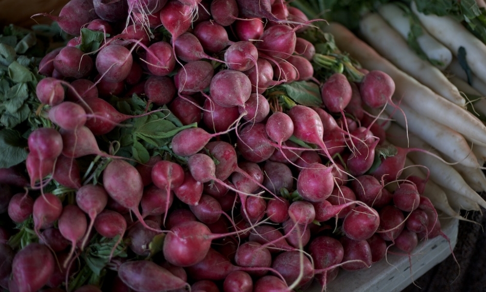
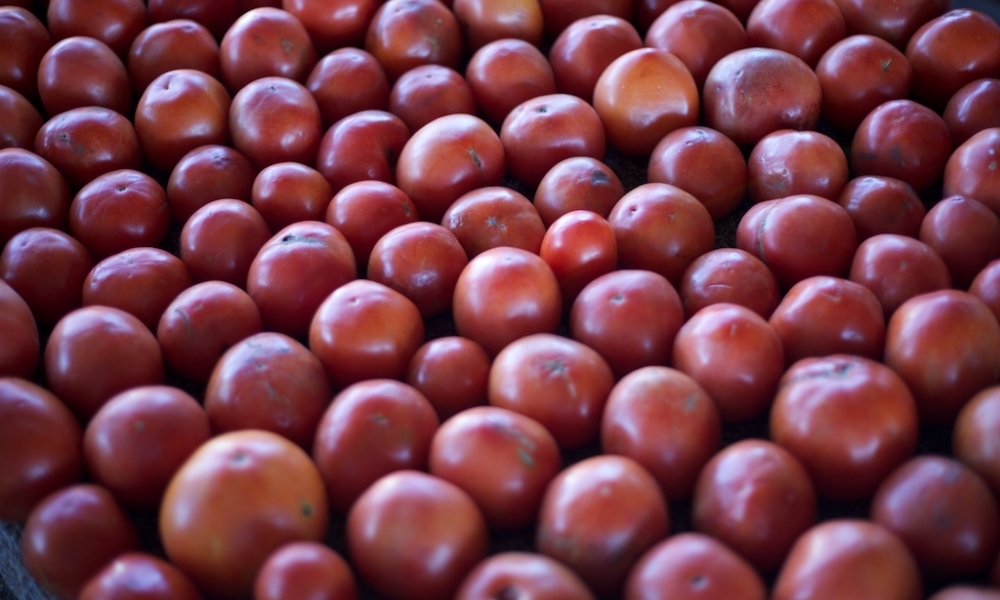
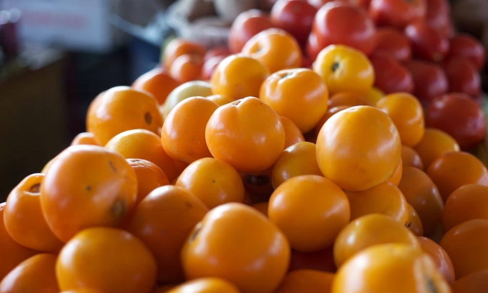
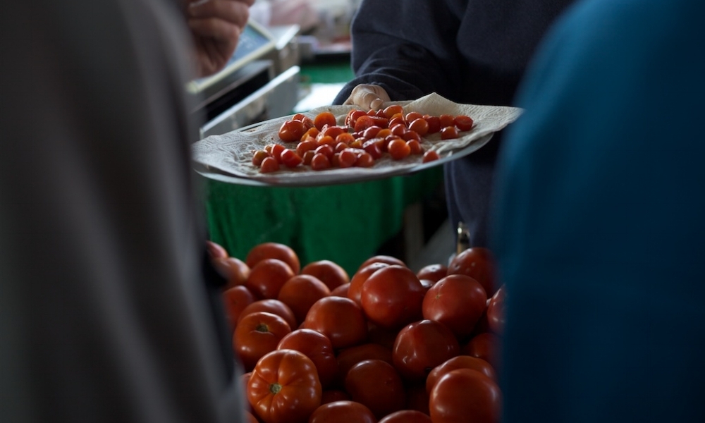
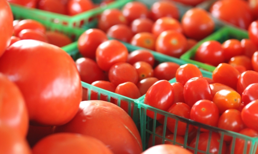
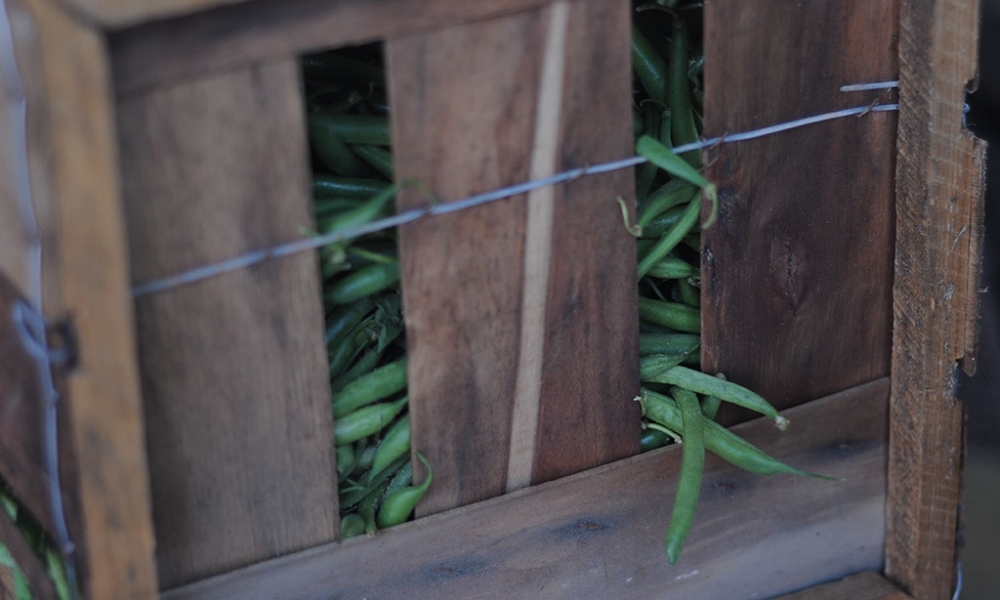
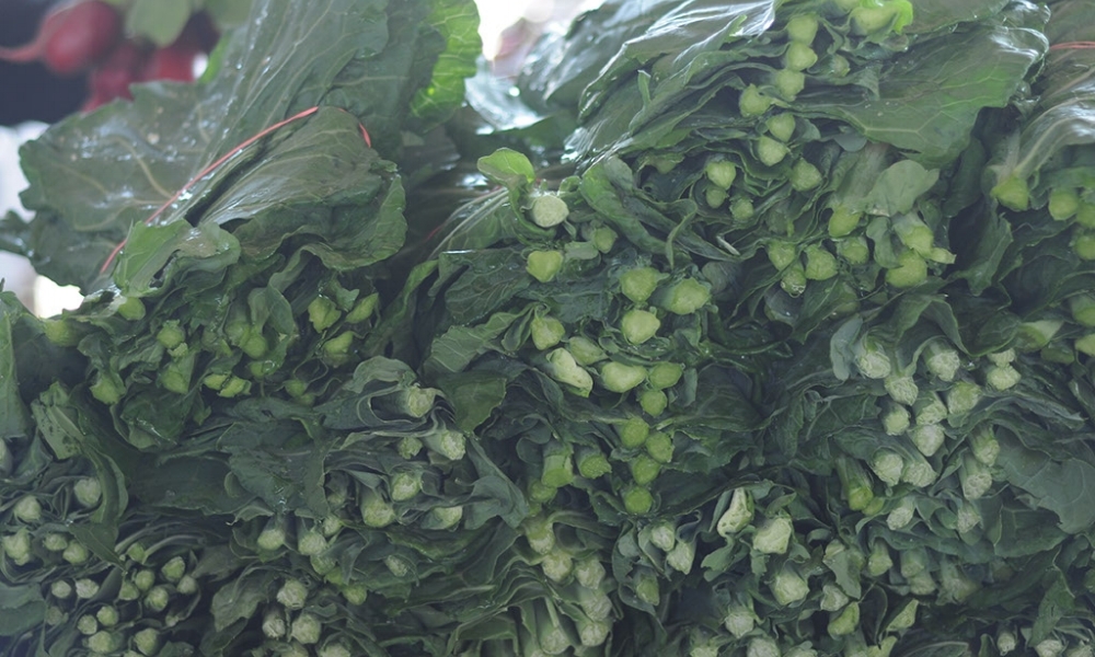
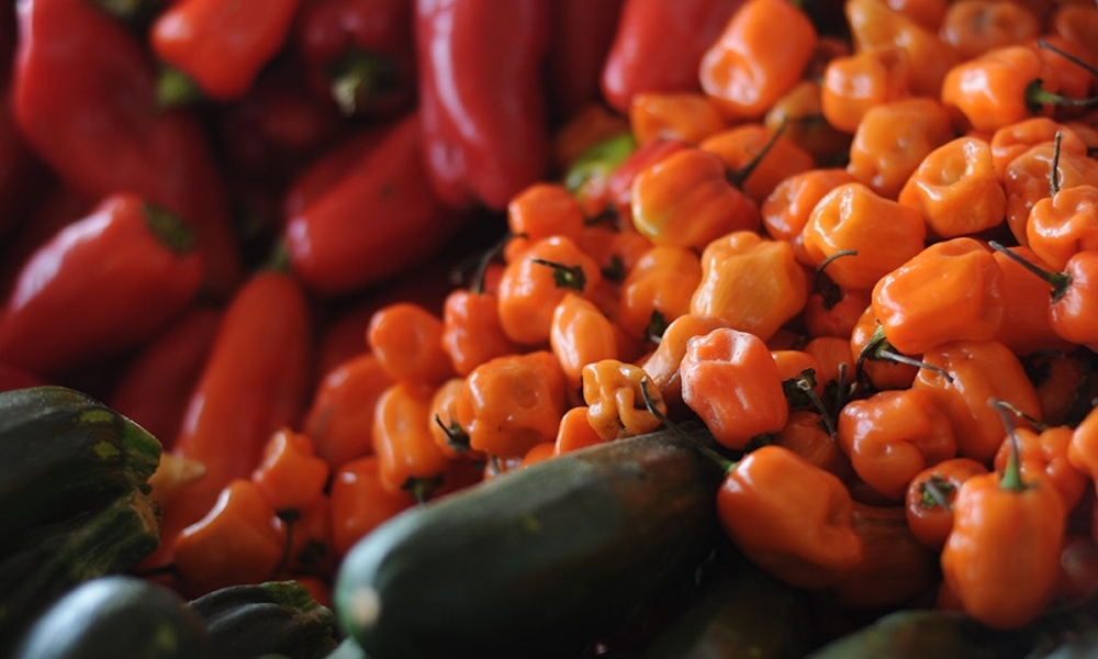
Local Research and Site Visits
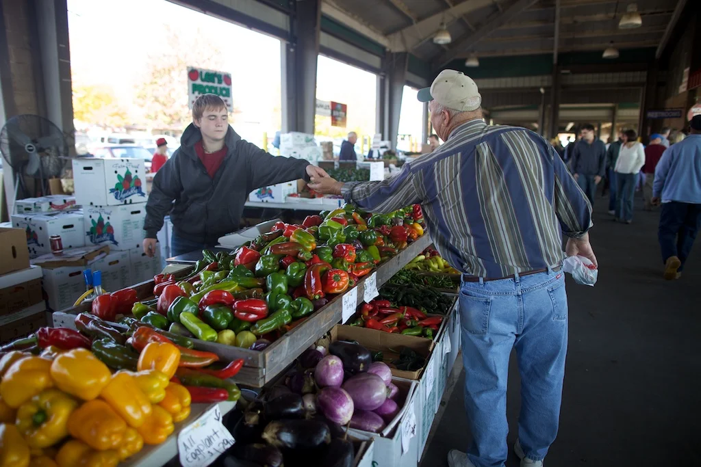
Next, we conducted a similar exercise, focusing instead on the offerings and experiences in our area: Raleigh, NC. In addition to documenting digital presences, we conducted site visits. During these outings, we observed the workings of the organization, observed users engaging with the provided services, and documented the interactions we witnessed.
Synthesis
Farmers Markets were plentiful. They gave young families a chance to spend a day together, and also allowed parents the ability to buy healthy options for their children. For the consumer, the experience was often meandering, and more about the outing than it was about the food. The producers present were often multi-generational and of different ethnic and socioeconomic backgrounds than the consumers. Grassroots Activist Organizations engaged with students who were passionate about making a difference in the world, and with parents who were interested in educating their children. As before, the food itself was often secondary to the main mission and vision. Higher end grocery stores offered Food-related Events that brought nutrition and cooking skills to participants. Often, these events were populated by couples on a date.
Many of these events had higher costs, and therefore catered to middle and upper-middle class participants. Raleigh has a large student population and a significant young professional family population, so many organizations and services that specifically catered towards these user groups.
Photos by Austin Simmons


Organize: After learning as much as we could, we collaboratively ideated around the overall experience and brand expression of our offering. We used our previous research to strategically position the brand in the market, then drafted a service diagram and created a user ecosystem to help achieve that vision.
Brand Positioning | Service Diagram | User Audit
Brand Positioning
Based on findings from local research, we identified a gap in the market for convenient, low cost, truly local options. However, we want to maintain the connection and passion observed in both Traditional CSAs and Grassroots Activist Organizations.
We positioned our service alongside others observed in our local community and area, even going as far as to include other types of food vendors such as grocery stores.
We positioned it along a variety of axes, including local/global, affordable/expensive, engaged/hands off, and individual/community.
Service Diagram
Based on our Brand Positioning, we ideated around a variety of touchpoints and user experiences that could help us achieve our overall mission and vision. From there we were able to draft a diagram detailing the inner workings of the service we would provide to our users. The service consists of four core user experiences: Distribution, Scheduling, Marketing, and Education.
For each of these, we created specific user touchpoints for each core experience, and selected a few words or phrases that could describe the ideal implementation of those touchpoints. We used our knowledge of our users (both food producers and consumers) to decide whether each touchpoint was more appropriate for a digital space, an analog one, or a physical experience.
Scheduling
convenience, variety, quality, customization, flexibility
Scheduling and product delivery would center around an intuitive, efficient digital system for both producers and consumers. Producers would provide information about the availability and quality of their products, while consumers could access that information to customize their product selection and meet their individual food needs. Delivery times and recurring delivery preferences would be incorporated into the system, insuring that customers experience an efficiency that caters to their schedule and their needs.
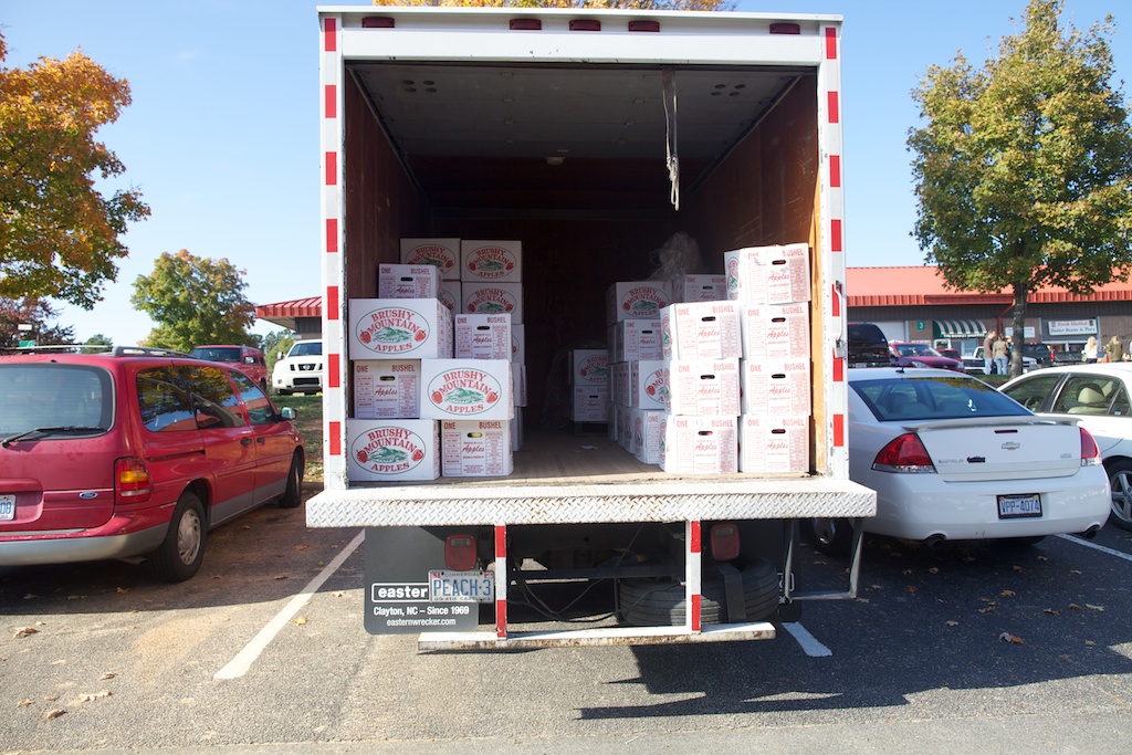
Distribution
efficiency, freshness, quality, access, convenience
To accommodate our customers' need for convenience, we would provide a weekly delivery service for any of our available products. After the scheduling portion is complete, delivery and distribution can begin. Products are picked up daily to make sure that consumers are receiving the freshest goods possible. Products are delivered to the staging area where they are sorted and packed into appropriate boxes for each customer. The boxes are then delivered directly to doorsteps, where empty boxes from previous weeks are also picked up for reuse.
Marketing
unification, consistency, credibility, approachability
The identity of our system is defined through our consistent referral back to the origin of our products. To foster a relationship between our customers and providers, we uncover the narrative that brings products from the producer's fields to the consumer's door. This narrative surfaces within every service touchpoint, from packaging to digital experiences, and engages the consumer by increasing their knowledge of the products they consume, as well as their willingness to advocate for local agriculture.
Education
advocacy, engagement, learning, awareness, sustainability
We provide more than just goods to our consumers. Education about the production, preparation, and consumption of food insures that consumers are considering origin, sustainability, and nutrition as part of their lifestyle. To further promote the relationship between producers and consumers, education initiatives would connect professionals with community members who have an interest in knowing more about their own food. Collaboration with schools and community groups would bring local food initiatives to younger generations.
User Audit
Users are the heart of every system. In this case, we have 3 distinct types of user groups: the producers who grow and make the food products we distribute, the consumers who purchase those products, and the Local's Market staff who care for every step in between. These groups all have distinct needs and expectations that must be met in order for the service to function smoothly.
Producers
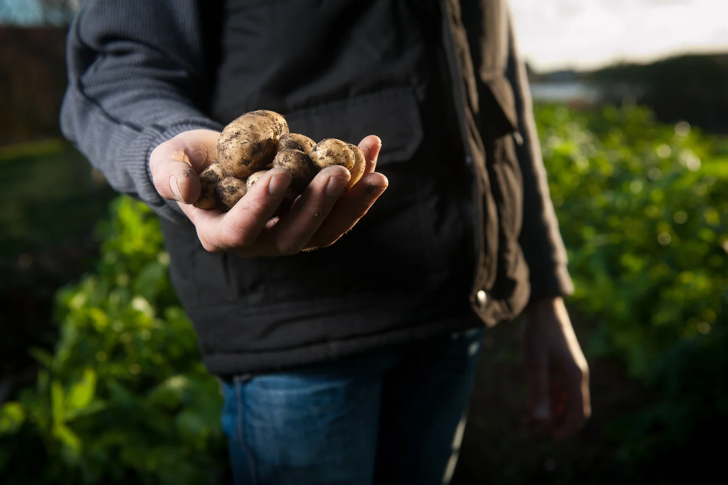
farm, community garden, bakery, plant nursery, butcher, florist, orchard
Since we are extending the scope of a traditional CSA, it only makes sense that we do that for the types of products we offer as well. In addition to traditional farms, we can also offer a variety of other sustainably crafted, locally sourced commodities.

Staff
webmaster, agricultural liason, warehouse staff, delivery drivers, education coordinator
The staff of The Local's Market help everything run smoothly. Some deal with distribution and scheduling, while others provide coordination and outreach for producers, and others maintain customer-side outreach and experiences.

Consumers
family, couple, individual, student, restaurant, food bank, soup kitchen, food truck
Consumer-users are potentially the most diverse user group. Some, like restaurants, have business needs that are solved by accurate and coordinated delivery, while others like a family or individual, may be more interested in participating in a variety of experiences.
Create: After conceptualizing the service, we created the brand and the messaging that we would use to communicate it to the world. This brand kit of parts included both linguistic and visual elements, ensuring a common representation of our brand no matter the situation.
Kit of Parts: Language | Colors and Typography | Iconography | Illustration | Photography
Language
Our first task was to create a common language used to communicate our offering to the public. We revisited our service diagram and the service-side aspects of the user experience, and broke it down into four customer-facing segments of the experience: Farm, Market, Garden, and Kitchen. Each of these relates back to specific sections of the service diagram, but speaks to the end user in a way that is understandable, direct, and friendly.

Farm
quality, variety, consistency
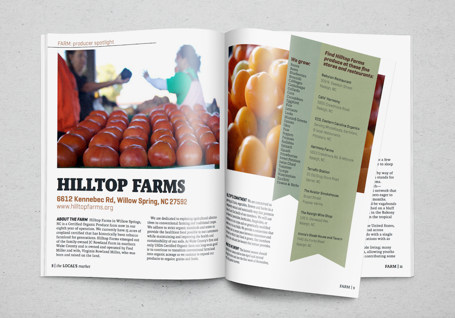
From the field to our hands, we care for your food before it gets to you. We maintain a rigorous selection process for our producers, ensuring you get the best food on your table, and all of our farmers, bakers, butchers, and artisans can expect consistent orders and courteous service. By engaging our customers in the narrative of the products they consume, we strengthen the relationship between producer and consumer.

Market
efficiency, freshness, customization
When it comes to picking your products, we’ll make it easy to find what you’re looking for. By providing a seasonal product catalog as well as an online marketplace, we make sure that our customers have the information they need to pick the products they want. Our intuitive system remembers your order history as well as dietary restrictions. Delivery preferences ensure that your weekly drop-off works for your schedule.

Garden
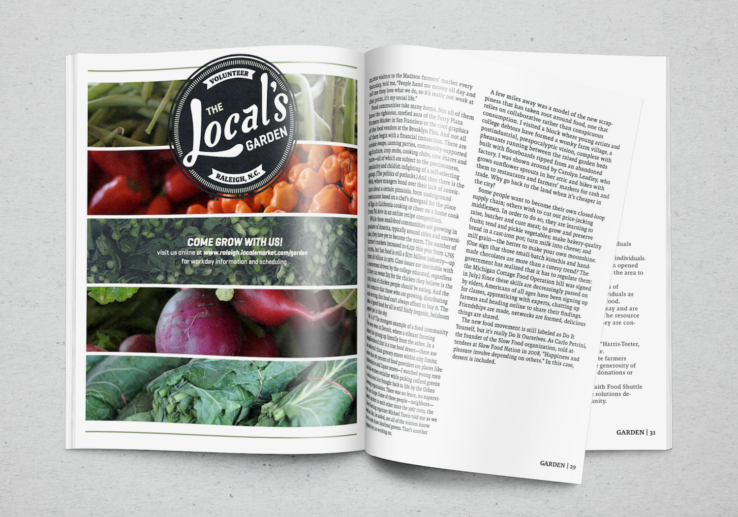
advocacy, renewal, sustainability
You can get your hands dirty, too! We’d love for you to join us in our community garden for a workday or attend a nutrition or food preparation event. The focus of the garden is to engage people in the processes that make local food production possible, as well as encouraging younger generations to take initiative in the continuation of this movement. Volunteering in the garden also gives you credits towards your weekly basket.

Kitchen
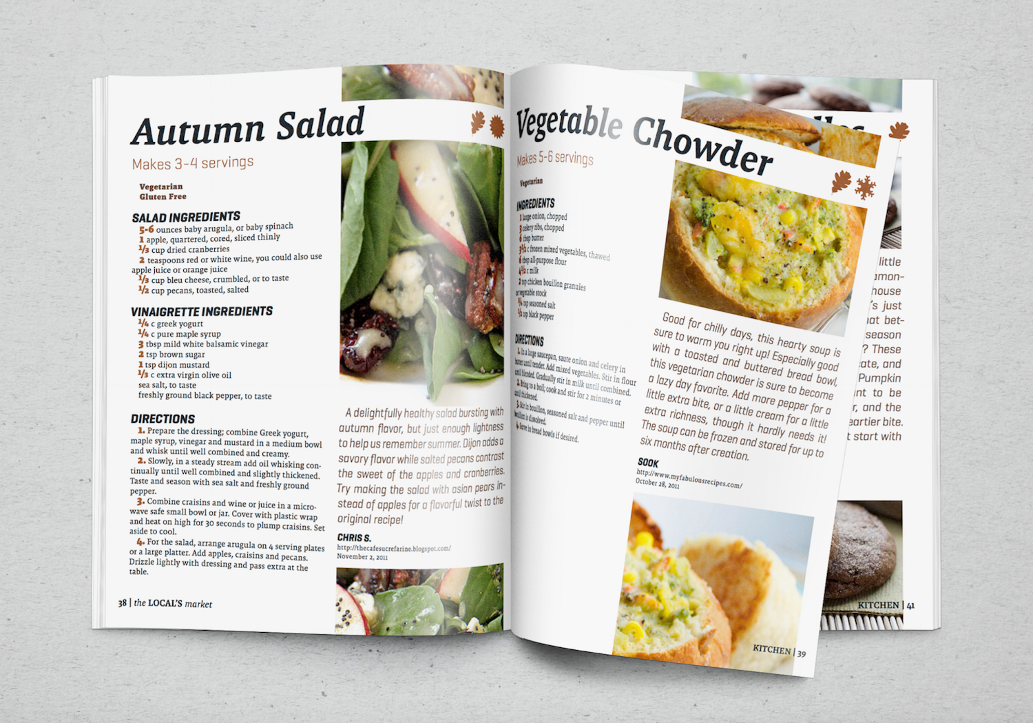
utilization, creation, engagement
We don’t just stop at the doorstep, The Local’s Market follows our products all the way to your table. Our website and app feature seasonal recipes catered to your weekly product selection. Cooking classes and our nutrition-tracking mobile app also help you actively engage in making healthy and conscientious choices. Let us write your shopping list so you can focus on enjoying your food!
Colors and Typography
The colors and the typography choices reflect the friendly yet earthy brand of The Local's Market. They are muted enough to be used in a variety of contexts, from illustration to UI design to print marketing material, but remain friendly enough to hint at the tight-knit community that The Local's Market establishes.
We started from a base palette of muted primary colors, and then extended the palette to accomodate digital illustrations, data visualizations, and sub-brand identities such as The Local's Garden.
The primary typeface is Malaga, designed for Emigre by Xavier Dupré in 2007. It is a typeface that offers weights suitable for extended reading and for bold headlines and display. Its quirky details and slightly unorthodox character make it a good choice for the slightly quirky yet friendly and approachable dynamic of The Local's Market service.
All designers contributed to the colors and typography.

Iconography
Much like the colors and typography, the iconography does double-duty. It maintains a sense of place and communicates meaning, while simultaneously showing a laid-back and fun side.
Functionally, the icons are used for larger graphic applications and are therefore not meant to be used at small sizes. They communicate the four user-facing facets of The Local's Market: Farm, Market, Garden and Kitchen. Additional iconography communicated ideas that are central to sustainable food consumption. Namely, the seasons and the type of food. Many of these icons tread the line between illustration and icon.
Iconography by Austin Simmons and Zoë Symon.
Logo by Garnet Fisher.


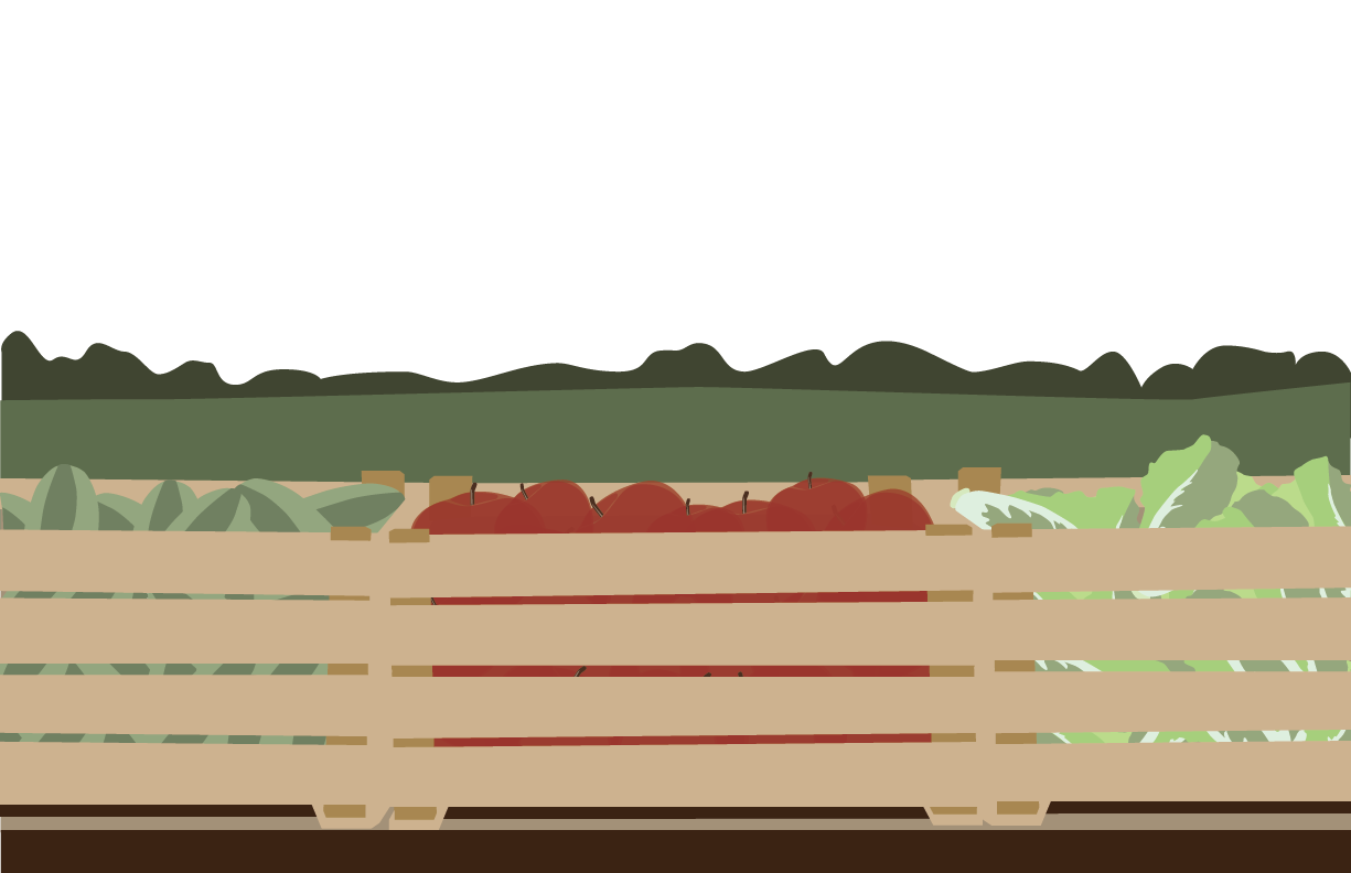
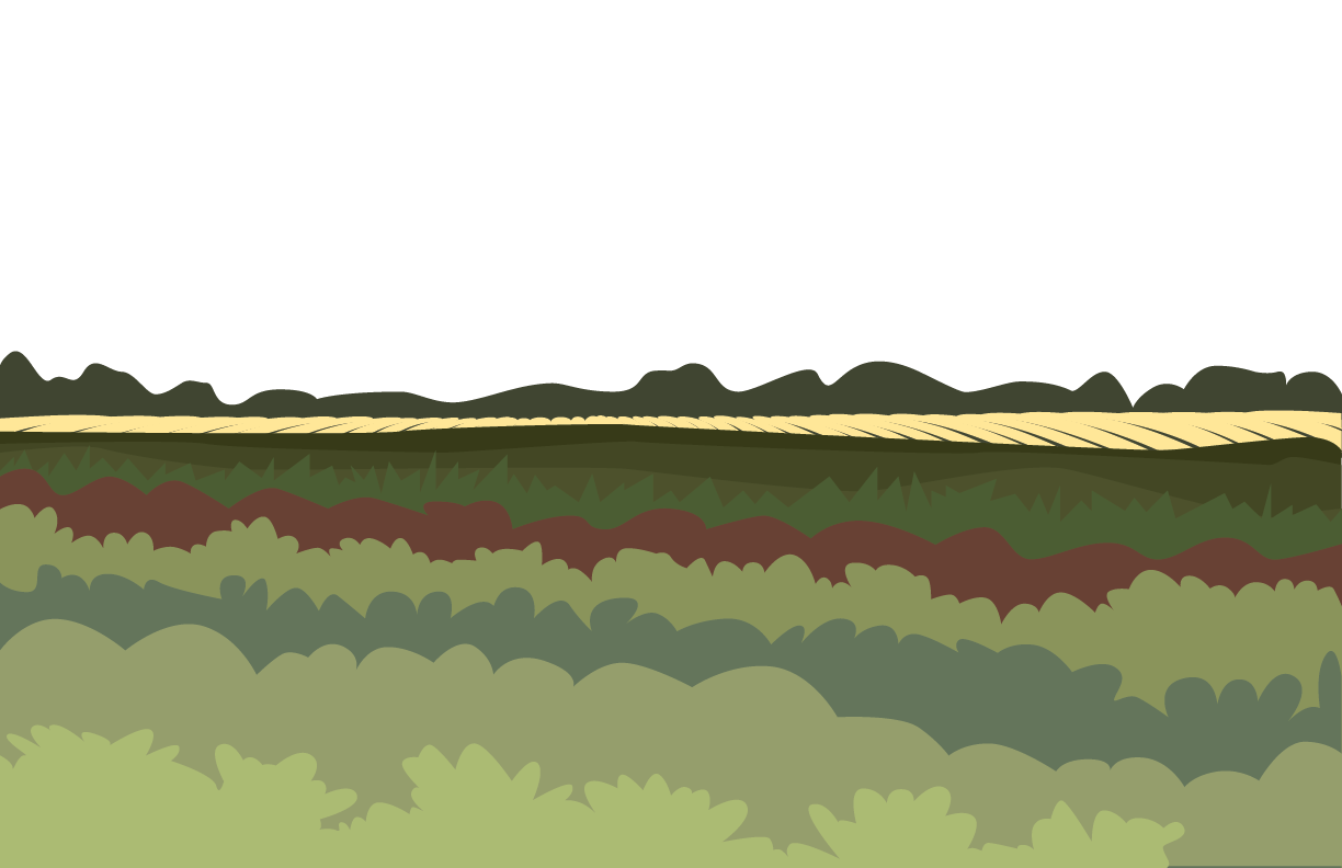
Illustration
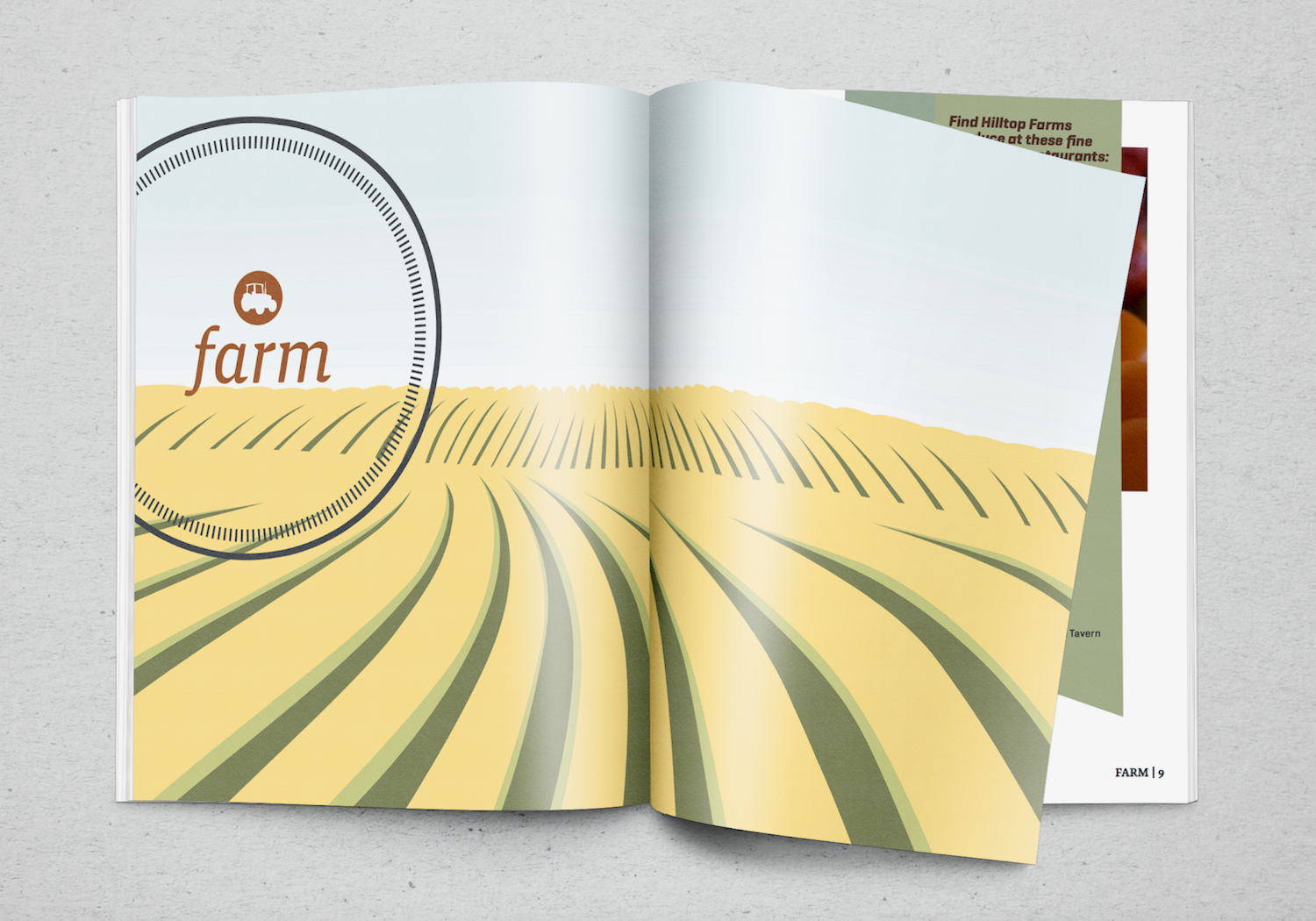
Where iconography can communicate meaning as well, digital illustration is primarily used for decoration and brand expression. The illustrations utilize the color palette of the brand, and also communicate the user-facing sections of the brand. They depict landscape representation of the Farm, Market, Garden, and Kitchen concepts.
Illustrations by Zoë Symon.


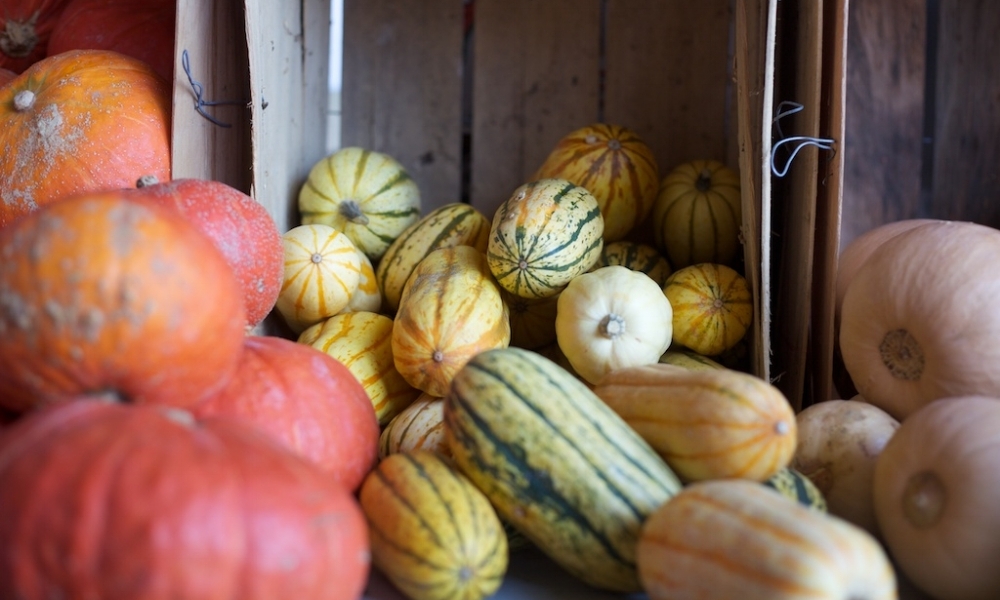
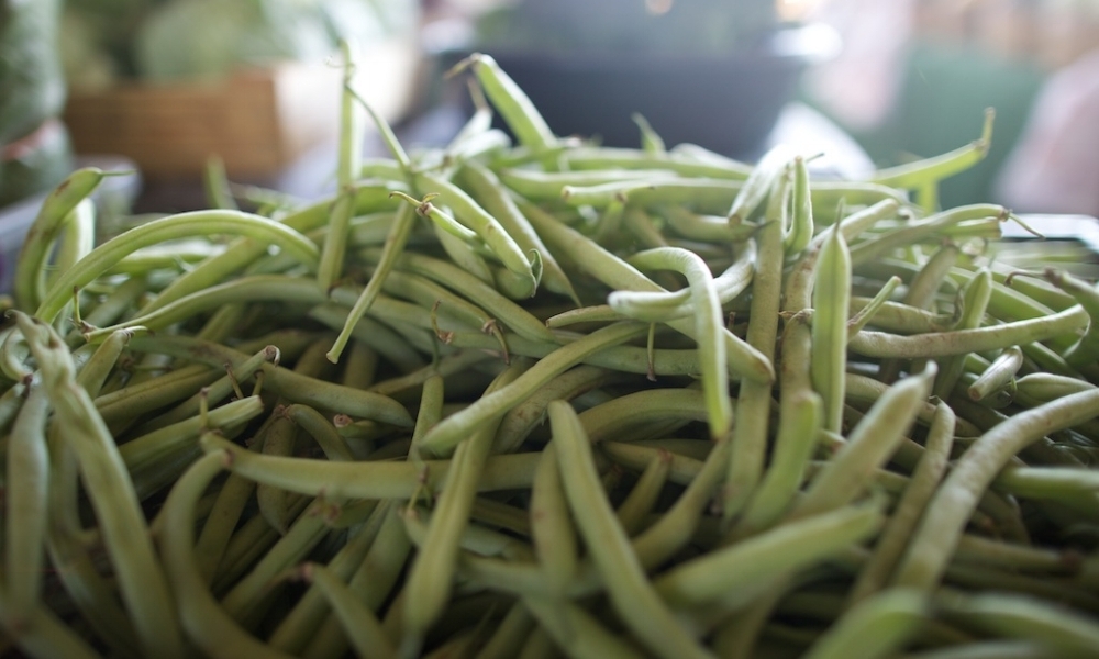
Photography
The majority of the photography was captured during local site visits, with a focus on documenting detailed shots of produce and products, rather than people and environment.
All designers contributed to the photo archive.


Apply: After creating this branded kit of parts, it was time to apply the graphic and linguistic elements to a variety of experiential service touchpoints.
Service Video | Experience User Flows | Tablet App | Magazine
At this point in the process, we diverged. Except where explicitly stated, all work displayed below is work I directly had a hand in. Service touchpoints I did not design are left out.
Service Video
The service video is a marketing tool used to showcase for consumers how food and products would get from our distribution center to their door.
The Service Video was conceptualized, storyboarded, and filmed by Austin Simmons, with minimal help from Garnet Fisher and Zoë Symon.
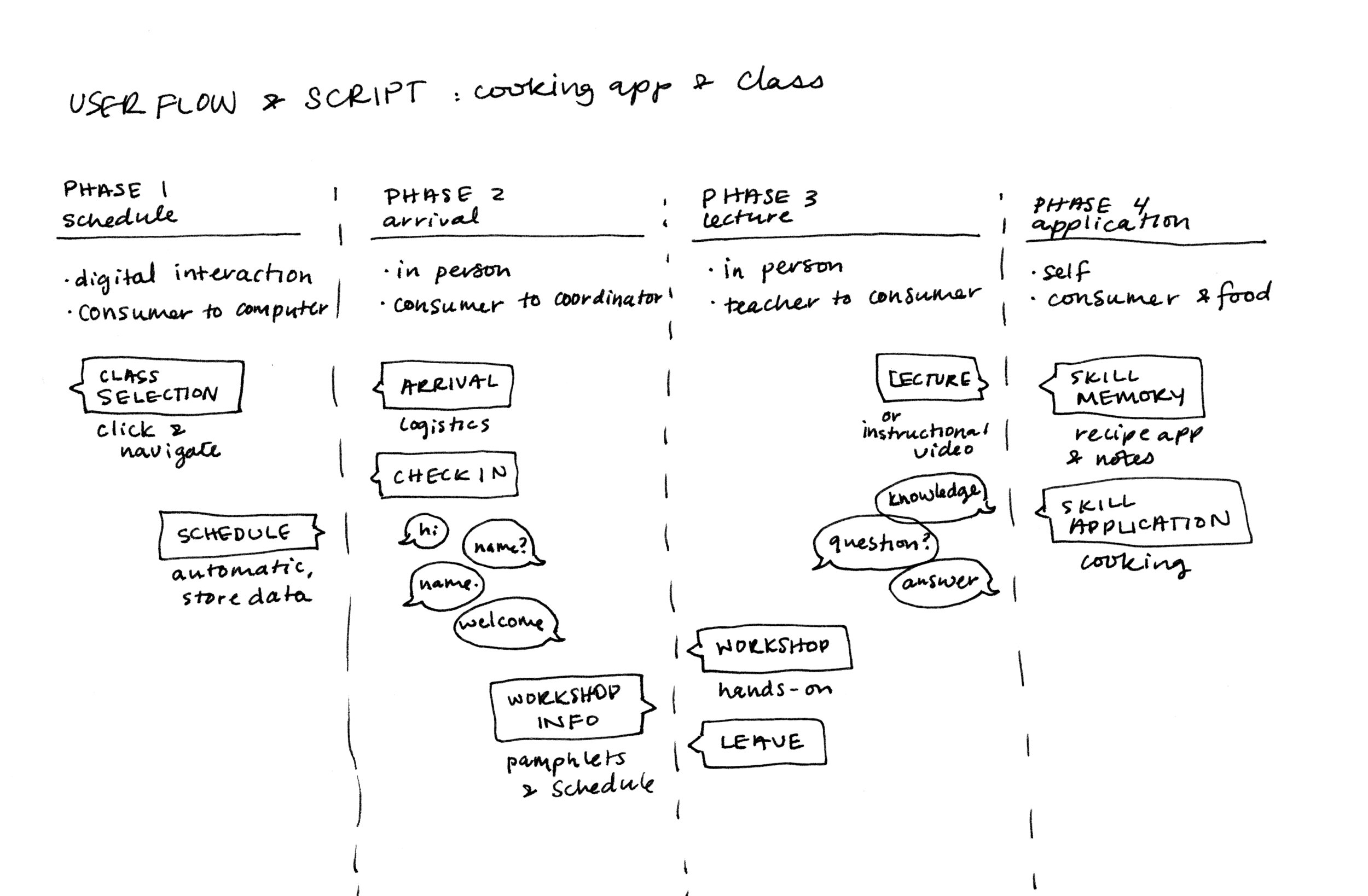
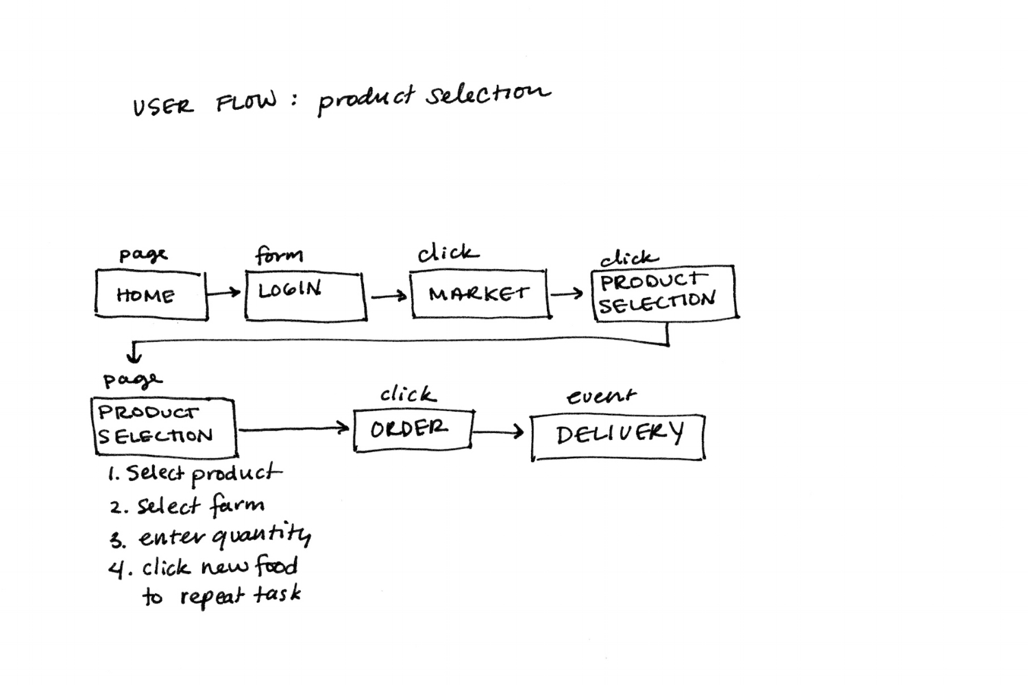
Experience User Flows
User flows document the ways in which any given user would move through the various service touchpoints and within individual touchpoints. They included user flows for both digital experiences, such as the website, and in-person experiences such as cooking classes.
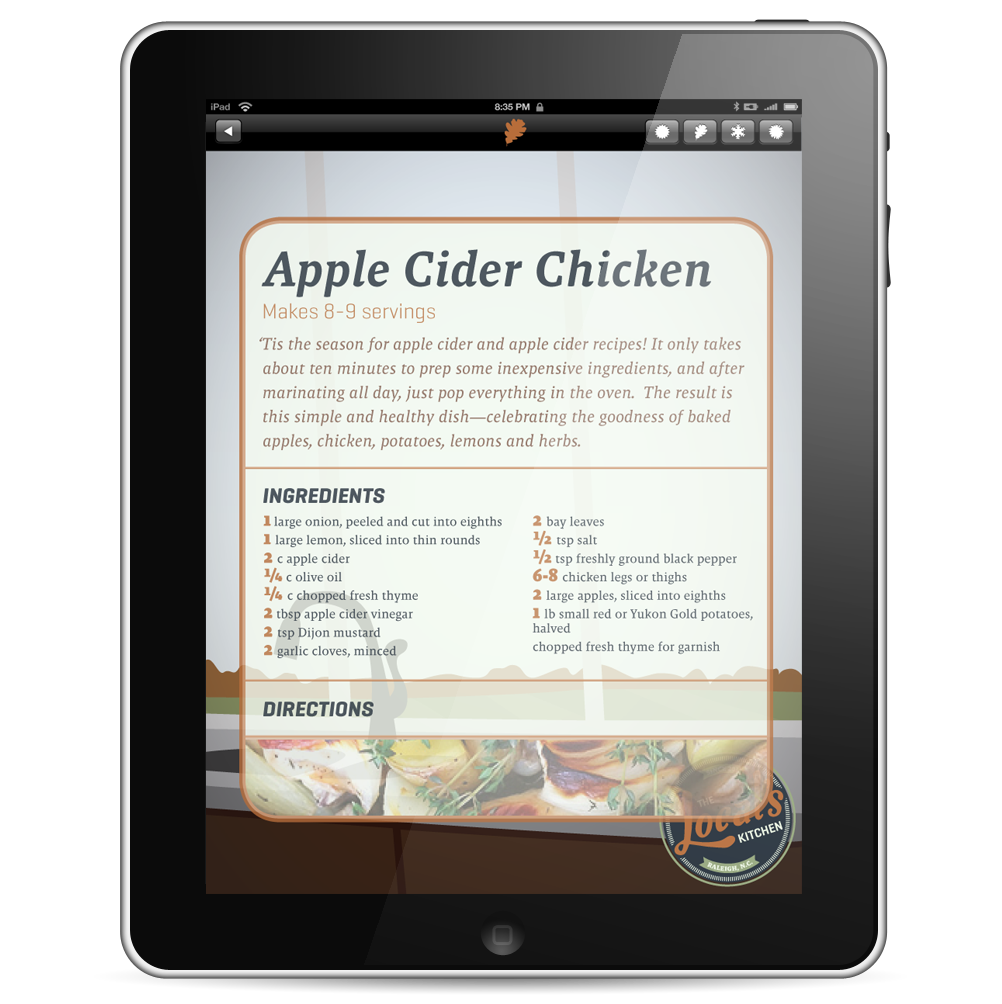
Tablet Recipe App
an iPad app for those who like to eat locally and seasonally.
The Local's Kitchen is a recipe app for use in the kitchen, and is used to facilitate the cooking of local, seasonal, enjoyable meals. It works with the other touchpoints of The Local's Market to allow consumers to utilize the ingredients they've purchased through the subscription service to cook nutritious meals and practice cooking skills.
The app is an exploration of iPad design. It utilizes GUI elements (circa 2011) in the creation of the app, and considers inherent iPad gestures alongside digital user experience best practices.

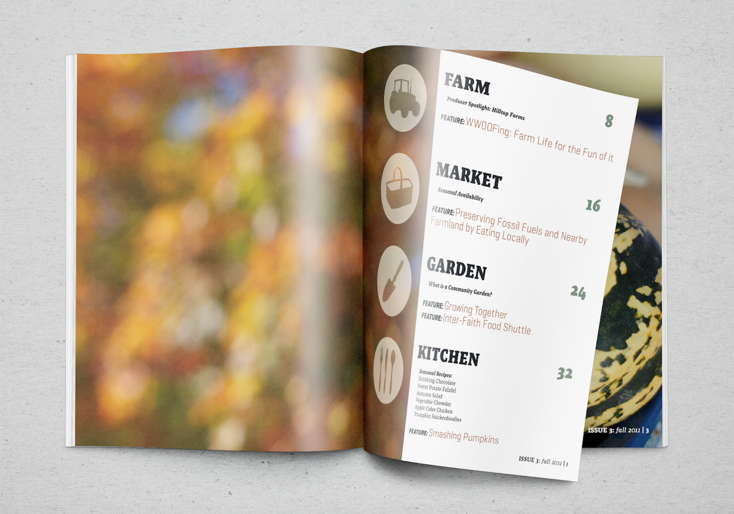
Subscriber Magazine
a seasonal magazine for CSA members.
This magazine is a seasonal magazine for subscribers. It is split into the four sections of the service: Farm, Market, Garden, and Kitchen. Each section includes recent articles pertaining to the topic and the season.
The magazine is an exploration in type designed for sustained reading, and explores the taxonomy and hierarchy of a traditional magazine by pulling together feature-length articles as well as shorter articles, interviews, and advertisements. It considers what information users would need in a subscriber magazine, such as recipes and directions for using their food products, while also considering what users would want out of a magazine, such as further education on specific topics pertaining to sustainability and profiles of the farms that are producing their food.
The magazine is a pamphlet bound booklet of 32 pages, with a perforated insert allowing less technical users to subscribe to The Local's Market in a way that is comfortable and accessible to them.
Retrospective: A student project with accolades. Reflecting on every experience allows me to learn.
This project was one of the most expansive of my educational career, really allowing me to stretch my abilities as a graphic designer, user experience designer, researcher, and system designer. It is here that I discovered my love for system-wide thinking.
One of the faults of this project lays in the amount of research done. If I were to continue work on this project, I would go back and conduct more generative user research. It is always user insight that leads to the most bold and successful solutions. When looking back on past projects, especially long-past projects, it is always easy to see what I could have done differently, or what I would redo. In this case, I can see where my skills have matured. However, the concept is strong, with just the right amount of idealism, and at some point I would love to redo this project to bring it up to date with current standards.