
Atlas Guides | Mobile App | Redesign Project
Inspire adventure and create confidence, from trailhead to terminus.
An app for thru-hikers and hiking enthusiasts across the world. Redesigned, added to, and researched from 2017-2020.
Should you wish to experience the app for yourself, Guthook Guides is available as a free download (with in-app trail guide purchases) from the App Store or Play Store.
The App
Guthook Guides is an app for hikers of long-distance hiking trails around the world. It launched initially in 2012 for sections of the Pacific Crest Trail and since then has expanded to over 50 hiking trails and bikepacking routes worldwide. The mission of Guthook Guides and its parent company, Atlas Guides, is to help hikers safely and confidently navigate long distance trails and all the logistics that such a hike entails.
The Problem
When I joined Atlas Guides as their first official employee, it was clear that there were some user experience pain points within the app. It was also not designed with an eye towards extensibility and the addition of new features, something that the team was eager to do. Keeping in mind UX best practices, common interaction patterns, my domain knowledge, and knowledge of our user base, I set out to craft some recommendations for the app.
The Team
Due to the small size of the team, much of the research, UX design work, user testing, and UI design was accomplished individually. However, I did solicit and receive extensive feedback from the rest of the team (CEO, Lead Android Developer, Lead iOS Developer, and Marketing Director).
Learn: The first phase of this project was to learn as much as I could about our user base and domain, adding to the knowledge I already had. I also took this time to thoroughly explore the as-is state of the app.
Survey | Persona Creation | Experience Audit
Survey
When I joined Atlas Guides, the team already had a survey in place to collect quantitative data about our users. However, the survey wasn’t generating very many responses, and I wanted to collect more data from a wider variety of current users as well as non-users who fit into our target user groups.
I created another survey and sent it out. I made sure that this new survey also contained some open-ended questions so that I could gather additional types of data from respondents.
Synthesis
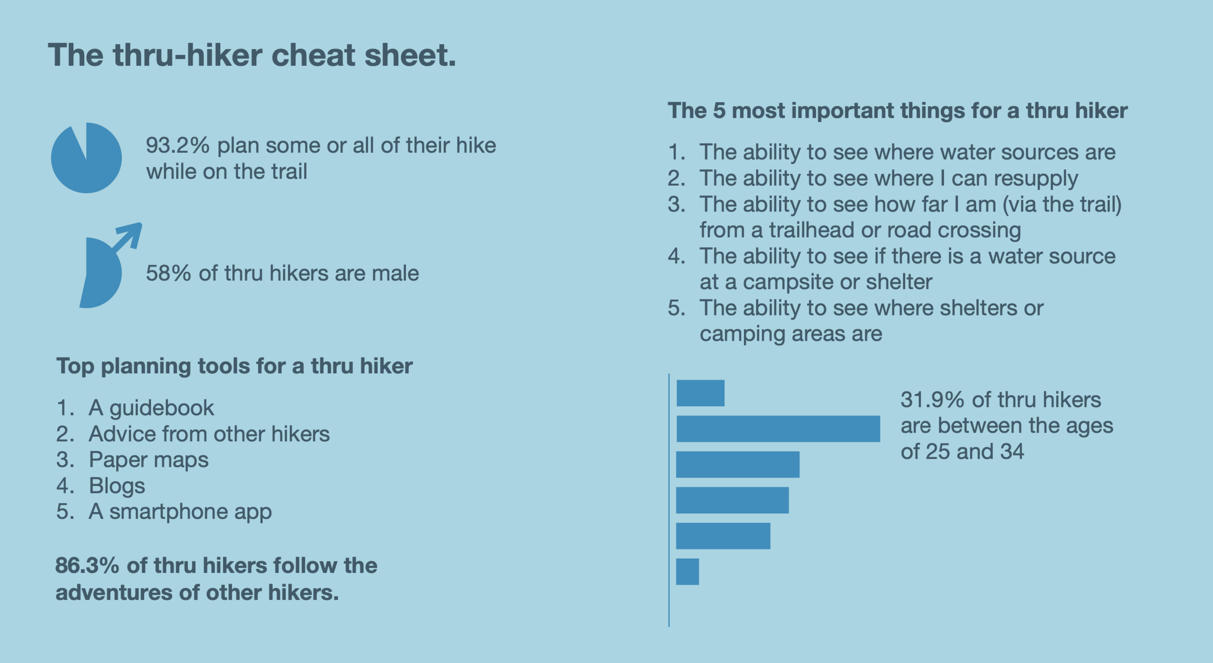
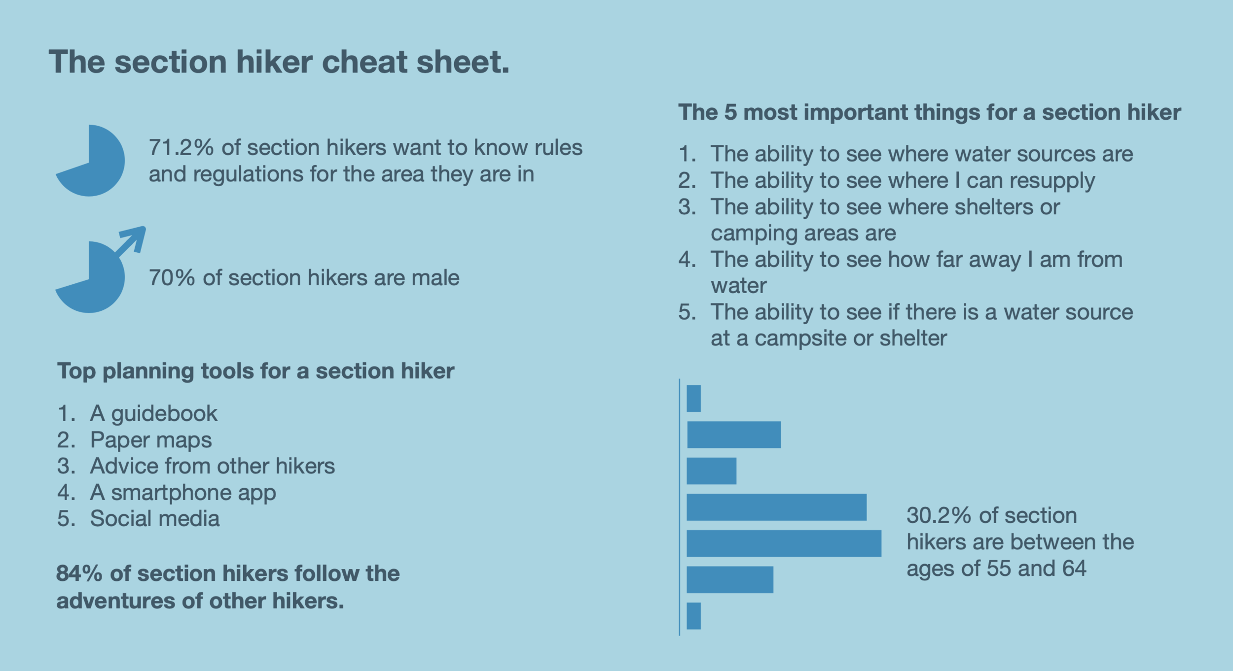
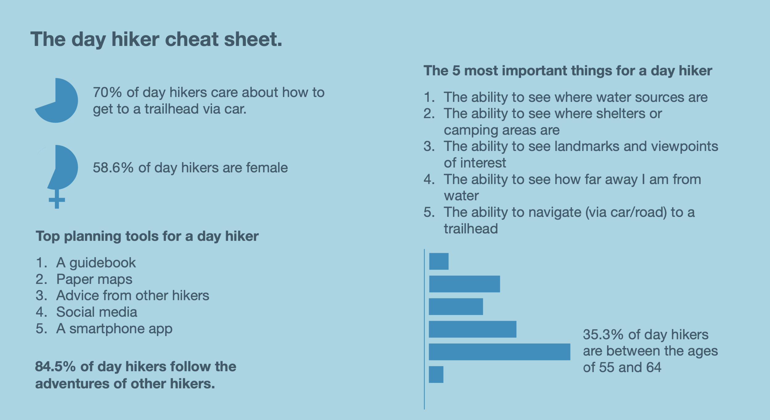
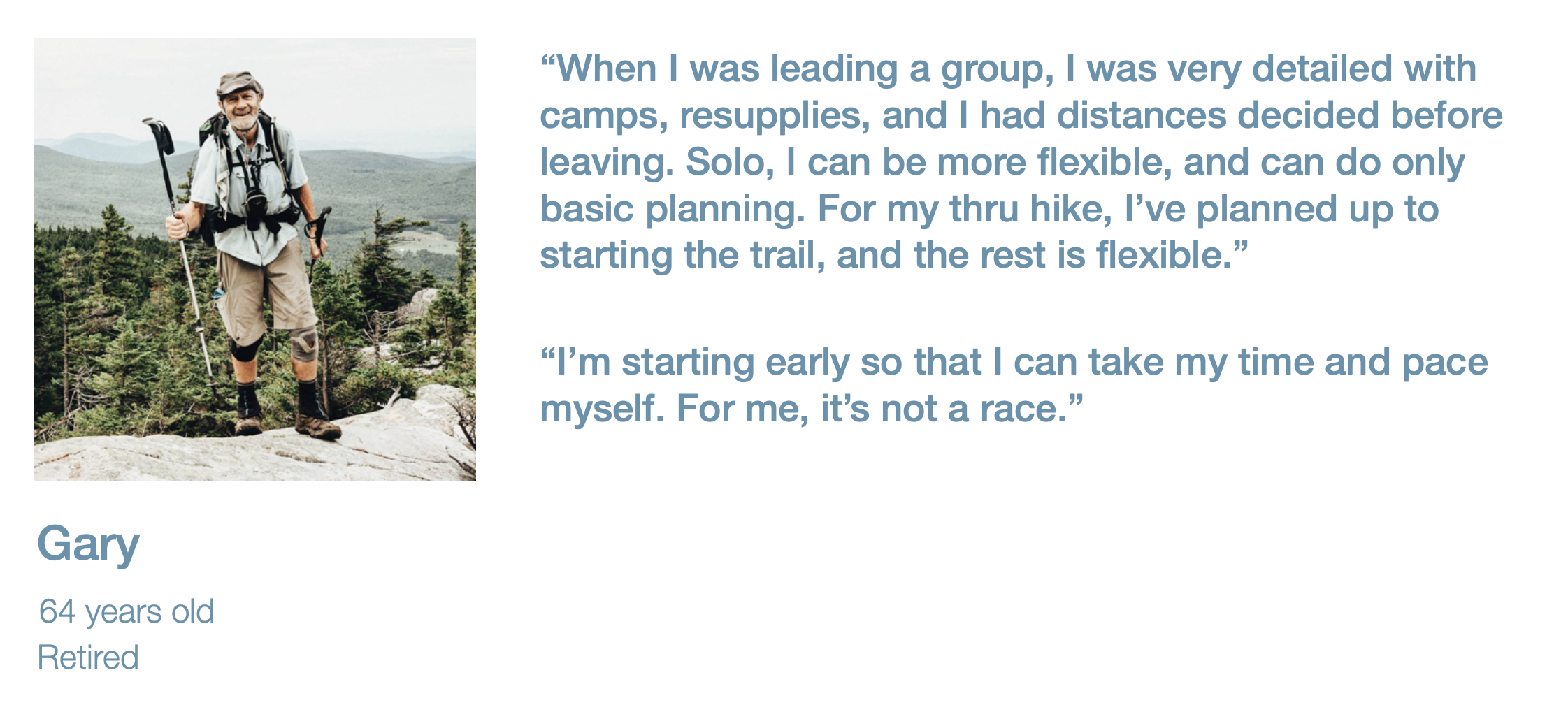
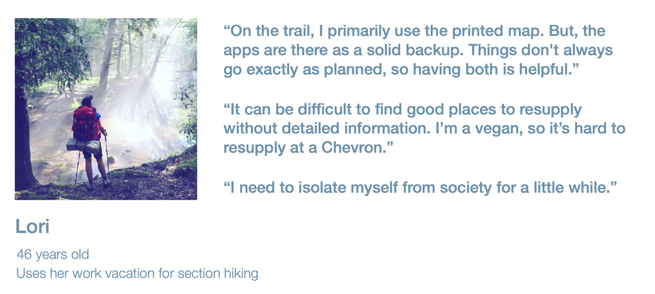
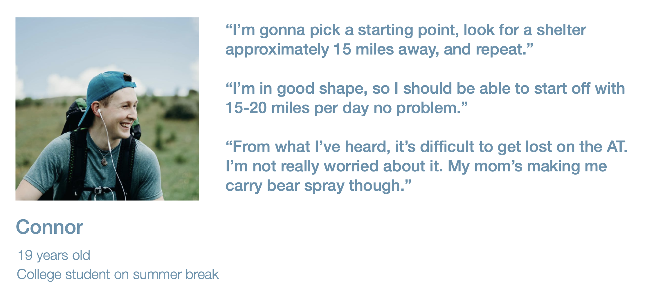
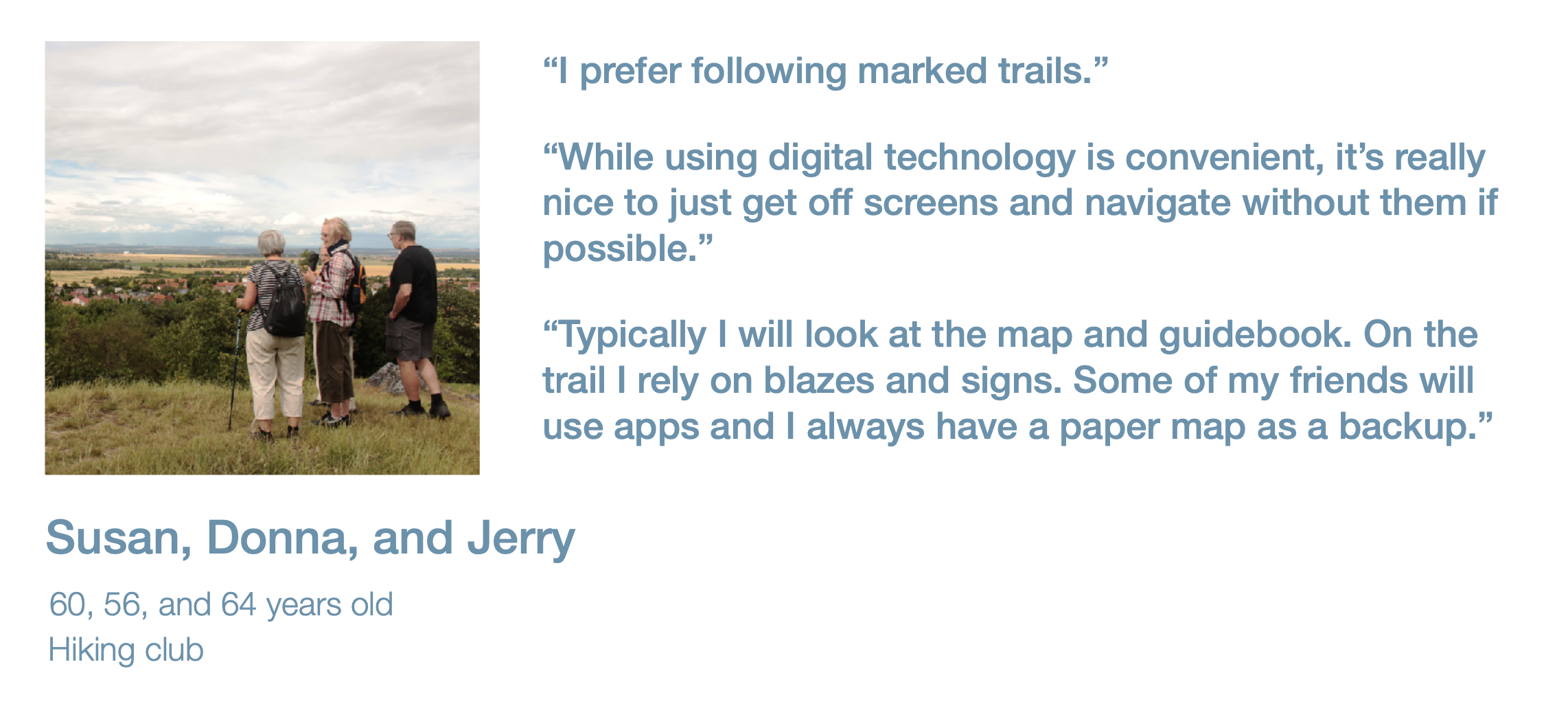
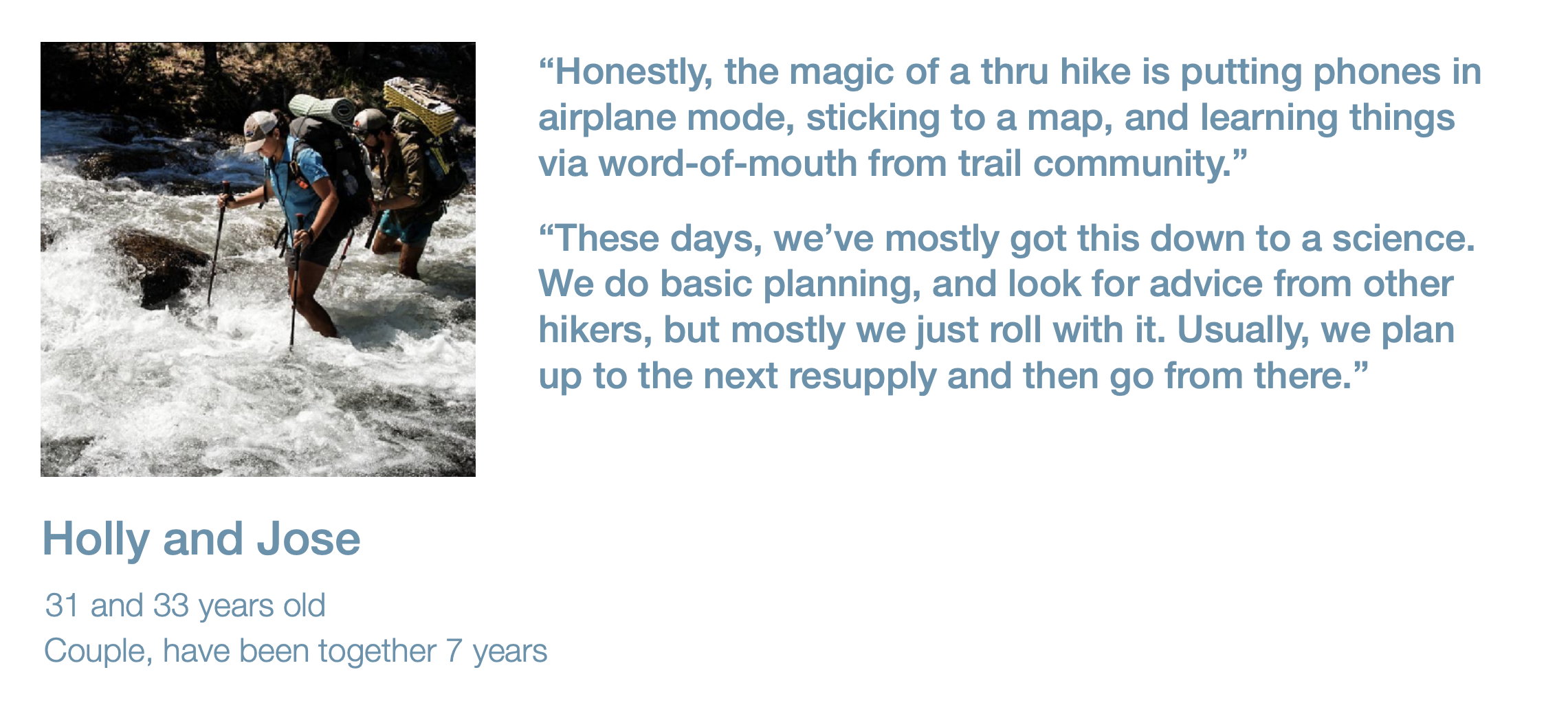
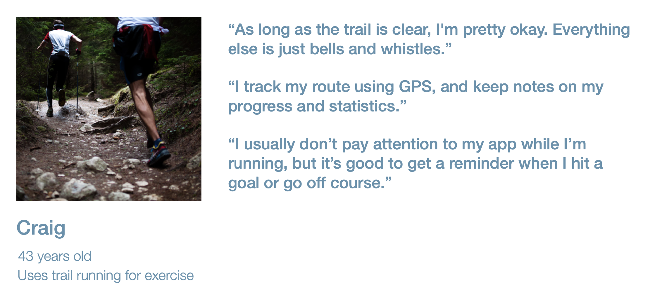
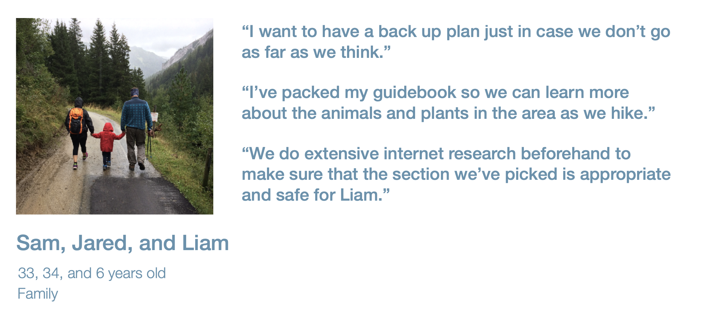
I used data from the existing survey as well as my new survey and distilled the results into a variety of new insights about our three main existing or target user groups: thru-hikers, section hikers, and day hikers.
I pulled this into a presentation to share with the rest of the team, highlighting motivations, traits, and direct quotes from respondents. I also created “cheat sheets” for each user group so that the rest of the team could continue to reference easy-to understand data to make more informed decisions.
Persona Creation
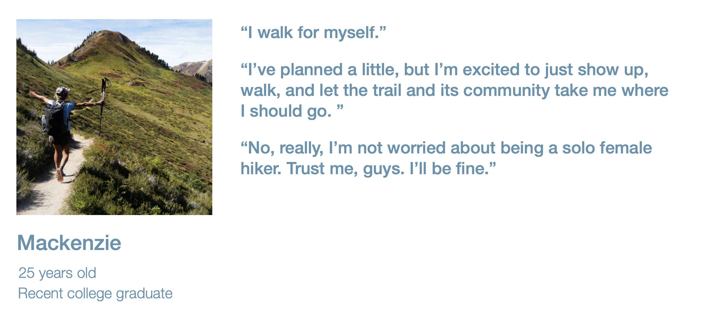
Based on the data collected in the surveys and from user interviews, I created a variety of personas to help myself and the rest of the team talk about our users. These personas also aided in further design thinking activities such as Empathy Mapping, Needs Statements, and, from there, Priority Grids and Experience-based Roadmapping

Experience Audit
In order to learn more about the existing app and highlight potential areas of opportunity, I first conducted an Experience Audit, including a Heuristic Evaluation. Though this mostly focused on the Android and iOS mobile apps, I considered the full user journey from learning about the app, downloading it from the App Store or Play Store, using it to plan a hike, all the way to using it during and after a hike.
Explore: In the next phase of this project, I took all that I had learned about our users and our app and explored potential UX improvements as well as possible solutions to user pain points.
Design Thinking Workshops | Pain Points and Areas of Opportunity | Wireframes
Design Thinking Workshops
When I joined the team, none of my coworkers were familiar with Design Thinking exercises or methodologies. I was able to facilitate both in-person and remote workshops to help all of us better understand our users and come up with possible solutions to their pain points. Later in the process, we were also able to successfully use Experience-based Roadmapping to decide on a way to move forward with some of the UX recommendations I had provided.

Pain Points and Areas of Opportunity
Through my knowledge of our users as well as the experience audit and workshops, I was able to define some areas of opportunity as well as some pain points for our users.
Discovery
Discovery was definitely an area of opportunity. For most of its existence, Atlas Guides had not actively marketed its app, instead relying on word of mouth within the hiking community.
Proposed solutions: website and SEO update, social media marketing, event attendance
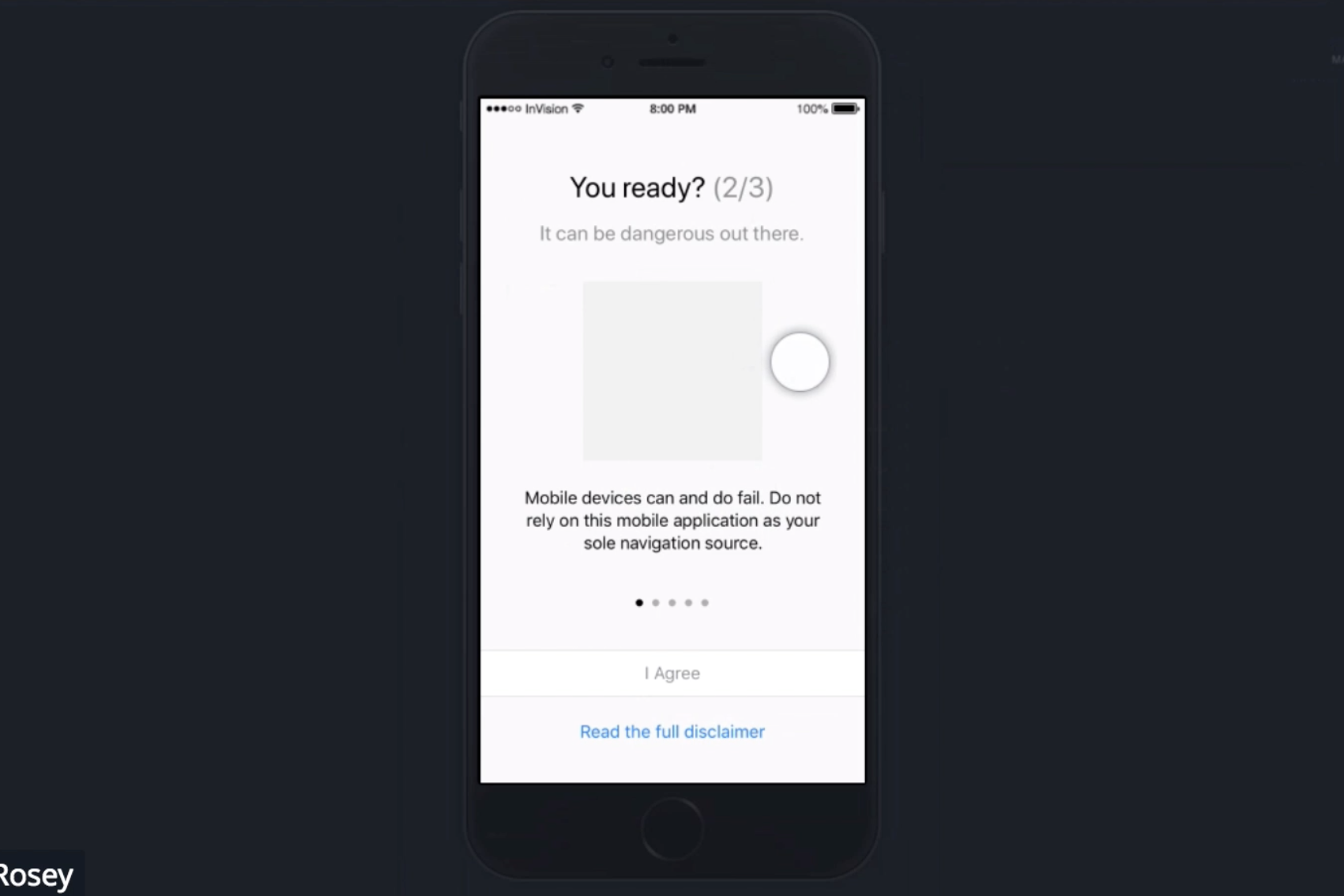
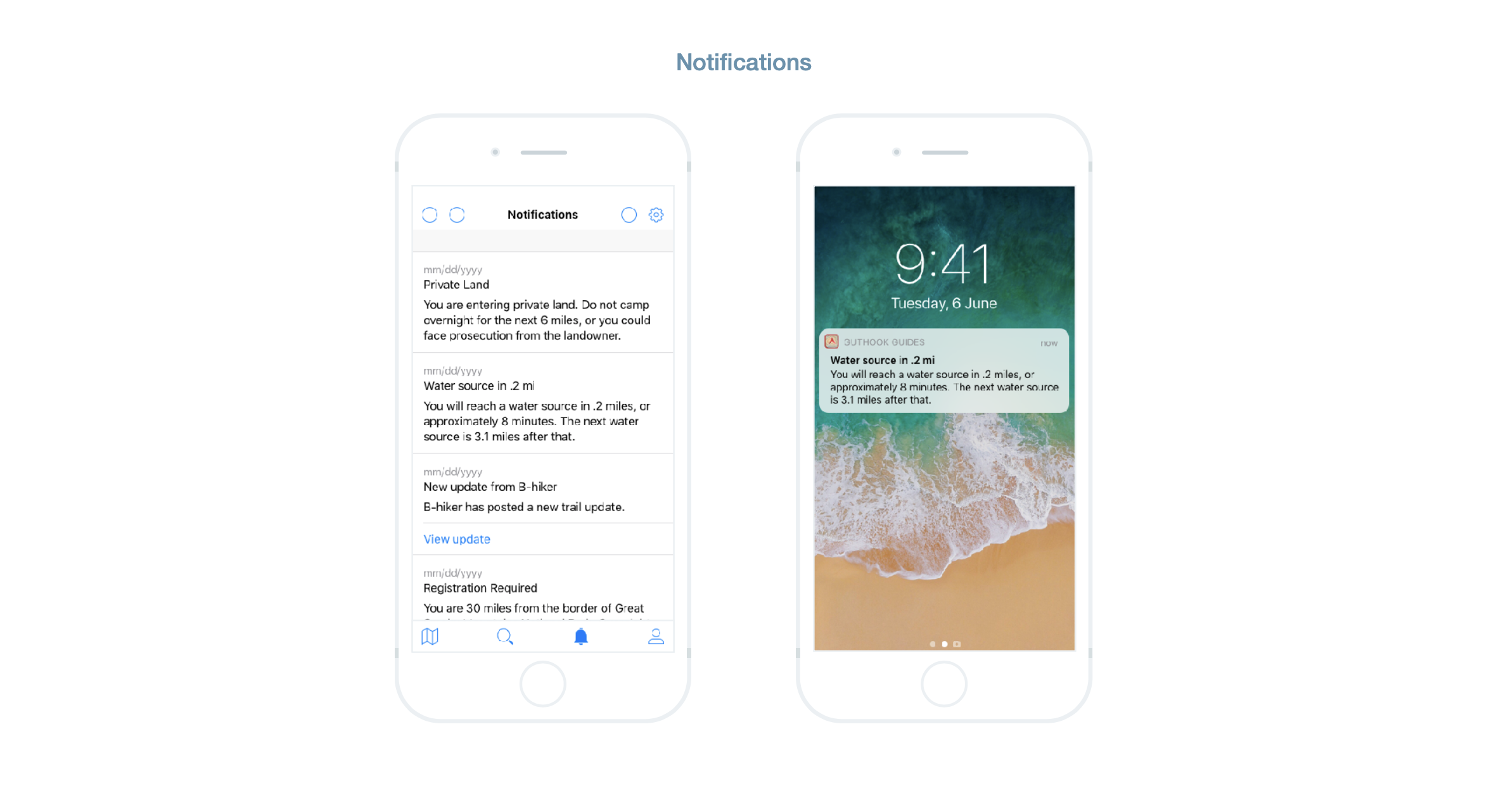
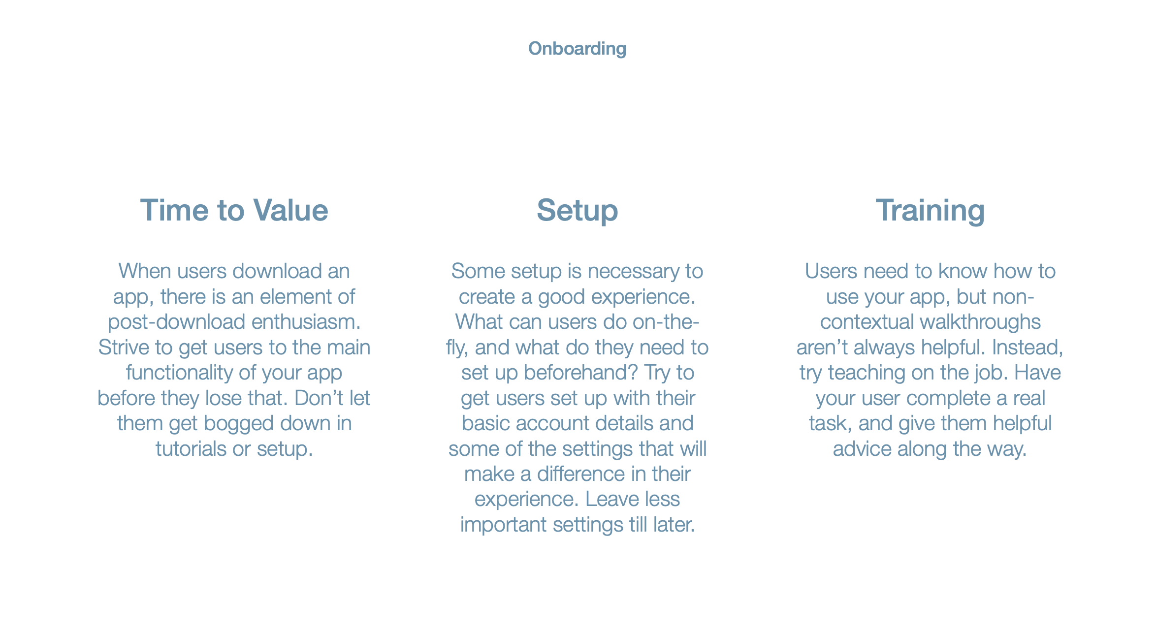
Onboarding
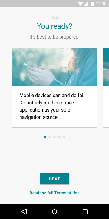
The onboarding experience was another area of opportunity, especially from a legal perspective. The onboarding experience should be a relatively quick experience (time-to-value) that leads users through any setup needed to effectively use the app.
Proposed solutions: onboarding redesign including abbreviated terms of use
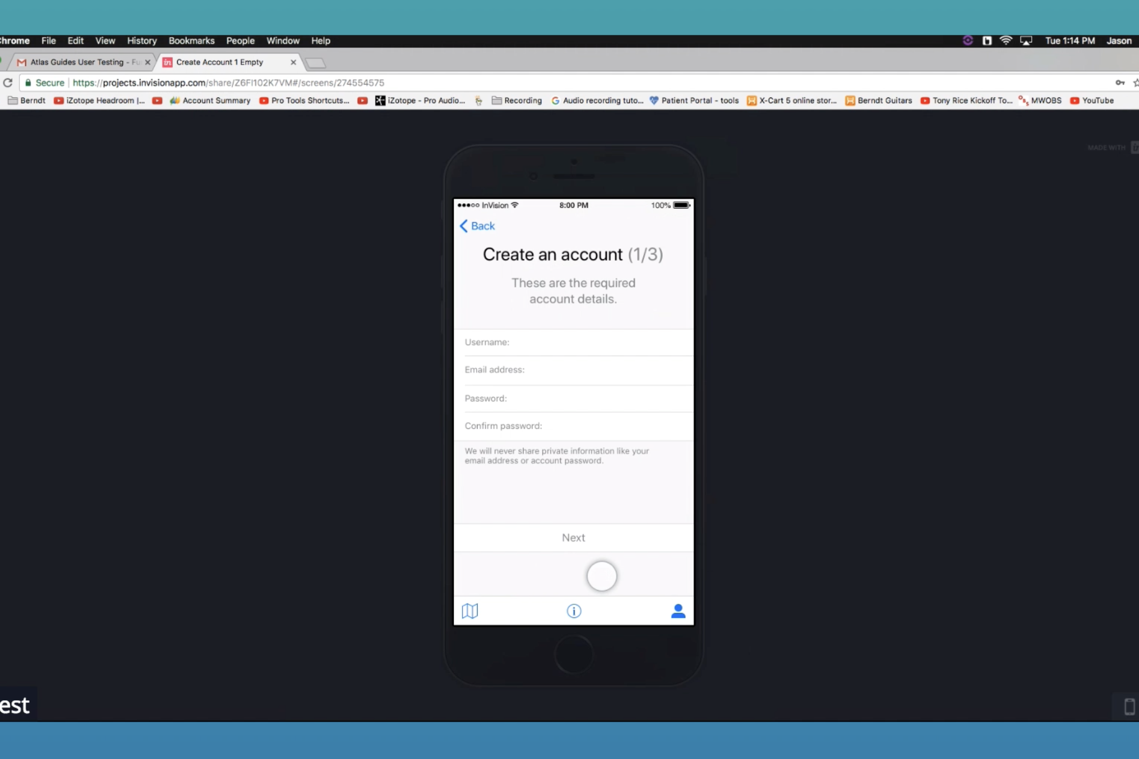
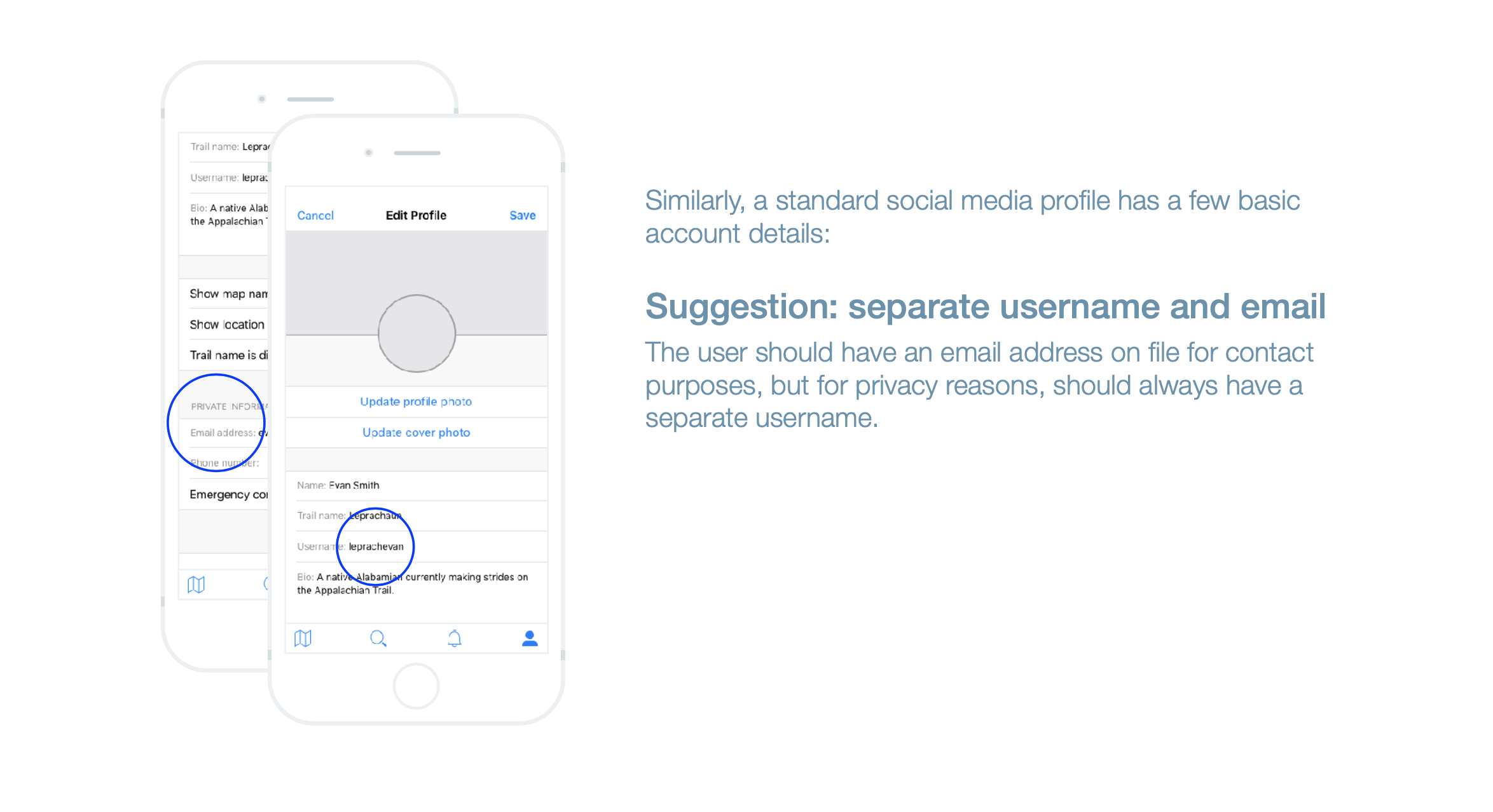
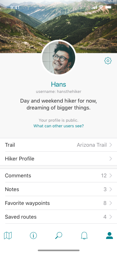
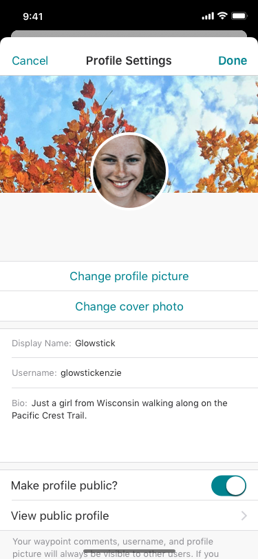
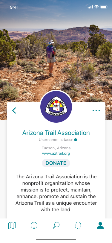
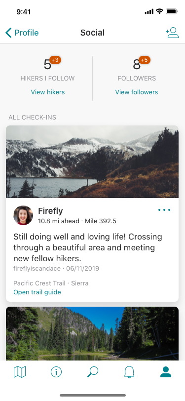
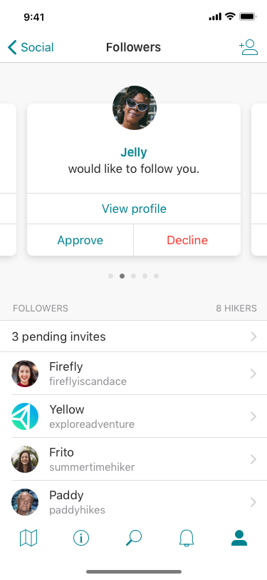
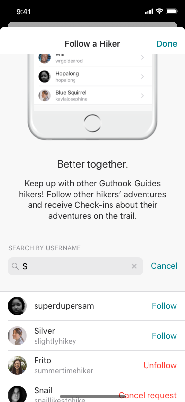
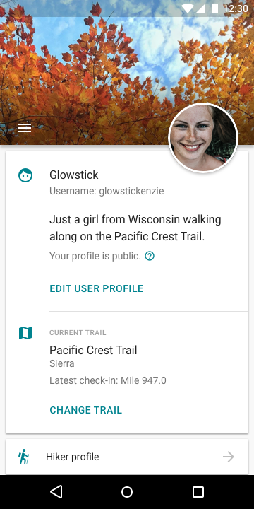
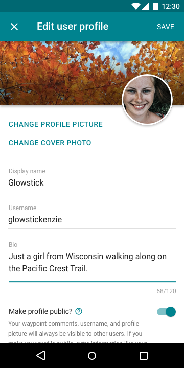
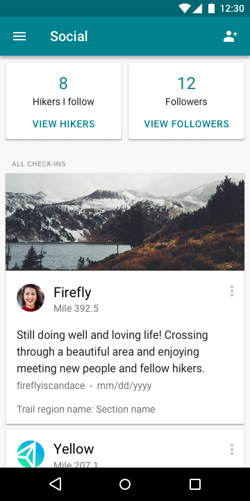
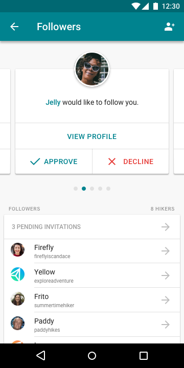
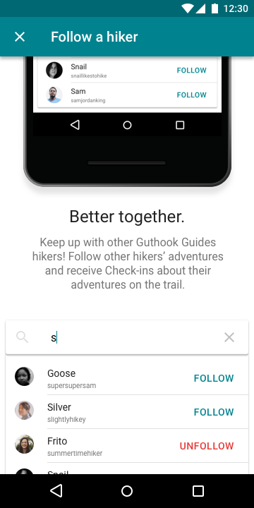
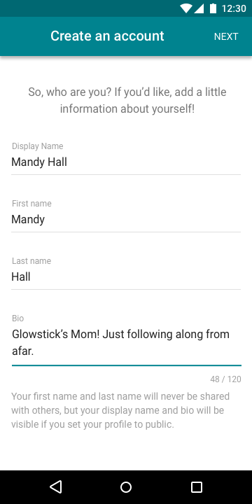
User Profile
The user profile is currently very basic. This presents an area of opportunity to expand social features and offerings within the app. Thru-hiking os often social, and there are already aspects of social interaction within the app.
Proposed solution: expansion of user profile features
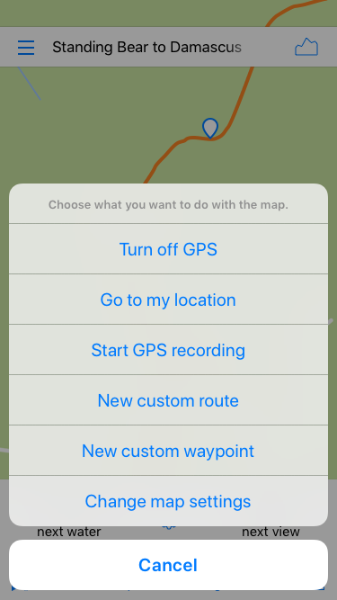
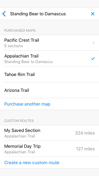
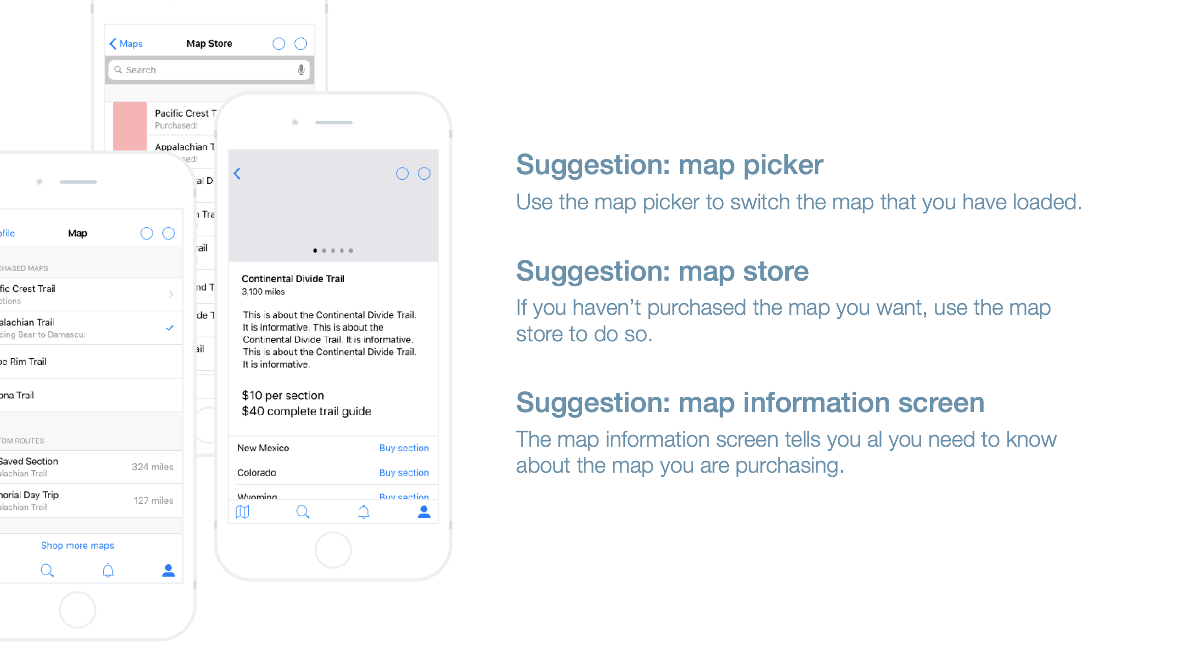
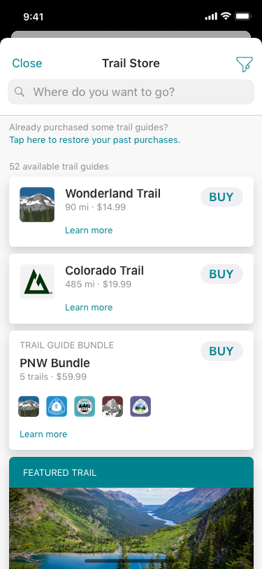
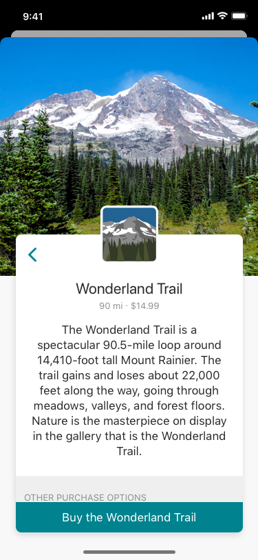
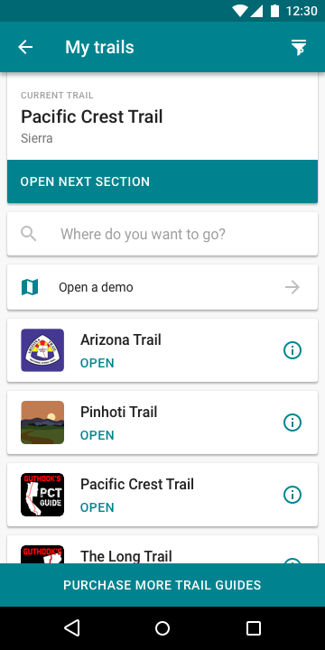
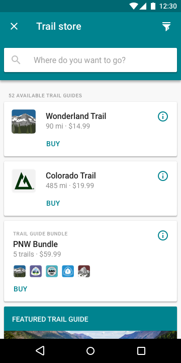
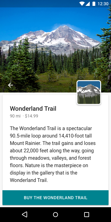
Purchasing
The purchasing system is currently a major pain point for both the user and for the company. Frequently, users cannot find the trail they would like to purchase, or do not even know that the company offers a particular trail guide. Improving this user experience will result in increased sales for the company as well as for a smoother experience for customers.
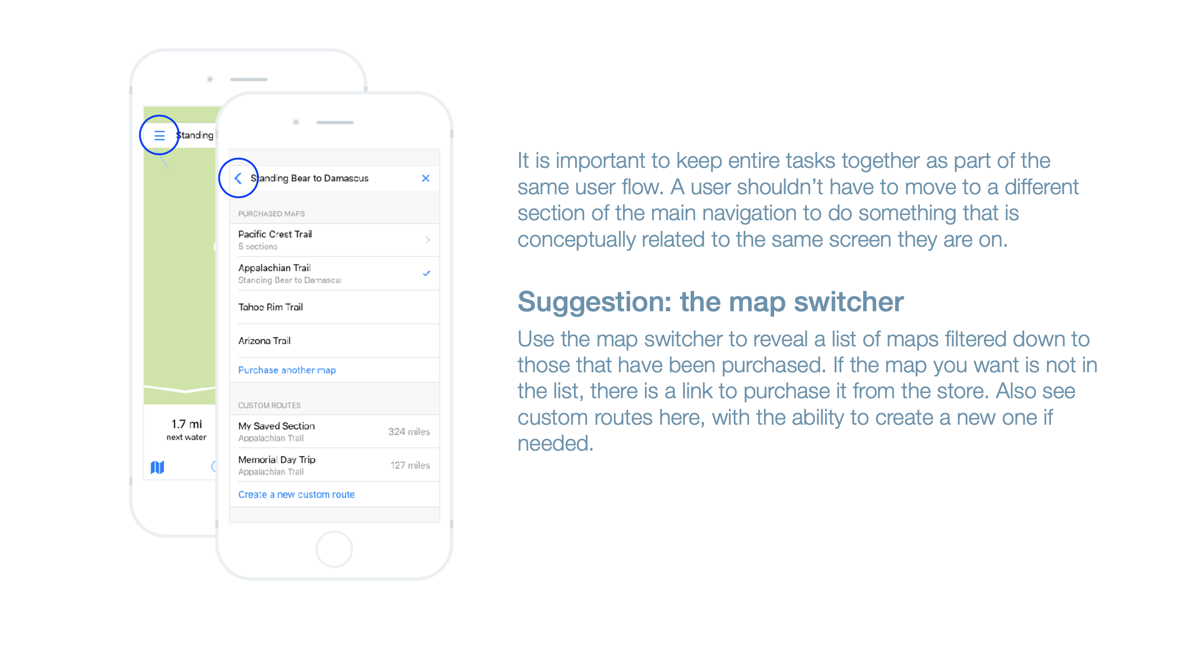
Proposed solution: Redesign of purchasing system, separation of purchased trails and available purchases
Route Creation
The ability to create a custom route is something that is beneficial to a majority of our user groups, especially section hikers. This feature exists in the app, but can be difficult to find and use. There is also a social area of opportunity here for users and hiking groups to share their favorite or planned routes.
Proposed solution: route creation experience redesign
Wireframes
Utilizing knowledge gained and artifacts created in previous phases of the project, I created a series of wireframes geared towards improving user experience and solving existing pain points.
Peruse the personal project that inspired me to join the team at Atlas Guides:

The Trail Guide
Mobile App | Experimental Project
A mobile app for long-distance hikers that offers maps, planning and guidance, a social community, and ways to record data about their hike.
Reflect and Review: After creating an initial set of wireframes, I set out to test my assumptions and my design.
User Testing and Interviews | Recommendations
User Testing and Interviews
The first step to testing my wireframes was to add them to an interactive InVision prototype so that participants could more easily interact with the wireframes remotely. This way, I could also step back into a much more observant role during the testing sessions.
Before starting any sessions, I developed a testing protocol and tasks so that I could compare sessions. I also made sure to recruit a variety of participants from across our range of users.
Always eager to gain more information about users and potential users, I also used this time to interview participants about their hiking experience and preferences.
Synthesis
After testing, it became clear that there were a few aspects of my design that needed to be updated. I made these changes to wireframes before embarking on further user testing.
Recommendations
Based on my research and testing, I synthesized my results into a list of detailed user experience recommendations for the team. I also crafted a presentation that went through some of the key pain points and proposed solutions.
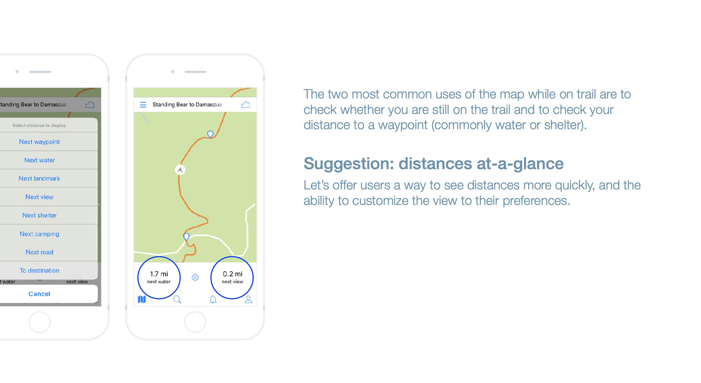
Many of these recommendations will enable hikers to use the app less often and find information faster when they do need to use the app.
Create: Once recommendations and experience updates were approved, I set about creating high-fidelity interface designs.
UI Component Design | High-Fidelity Wireframes | Prototype
UI Component Design
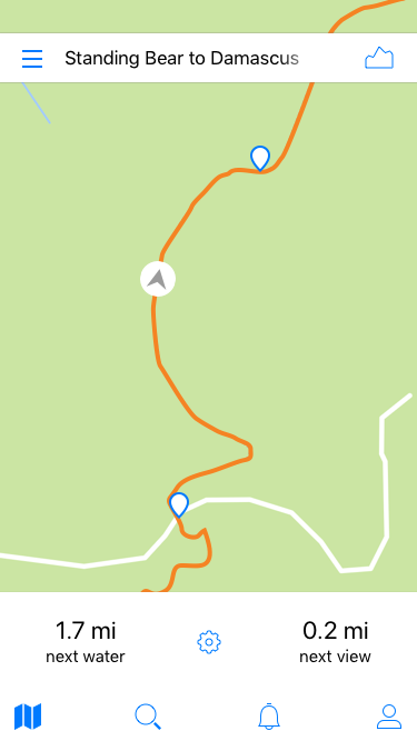
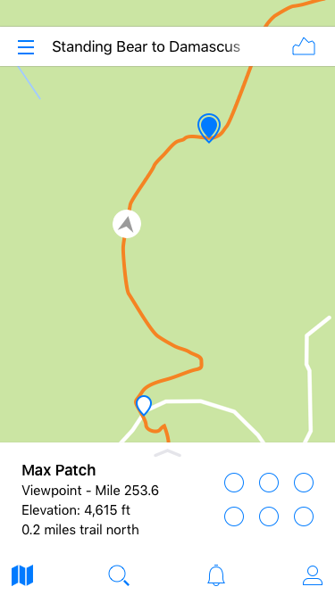
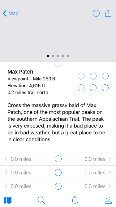
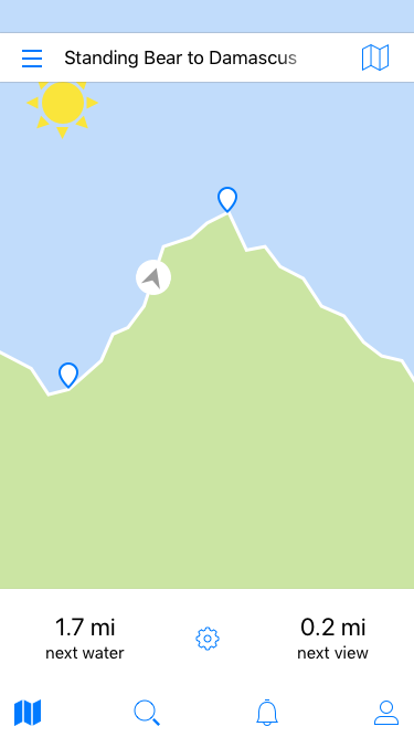
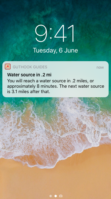
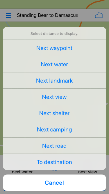
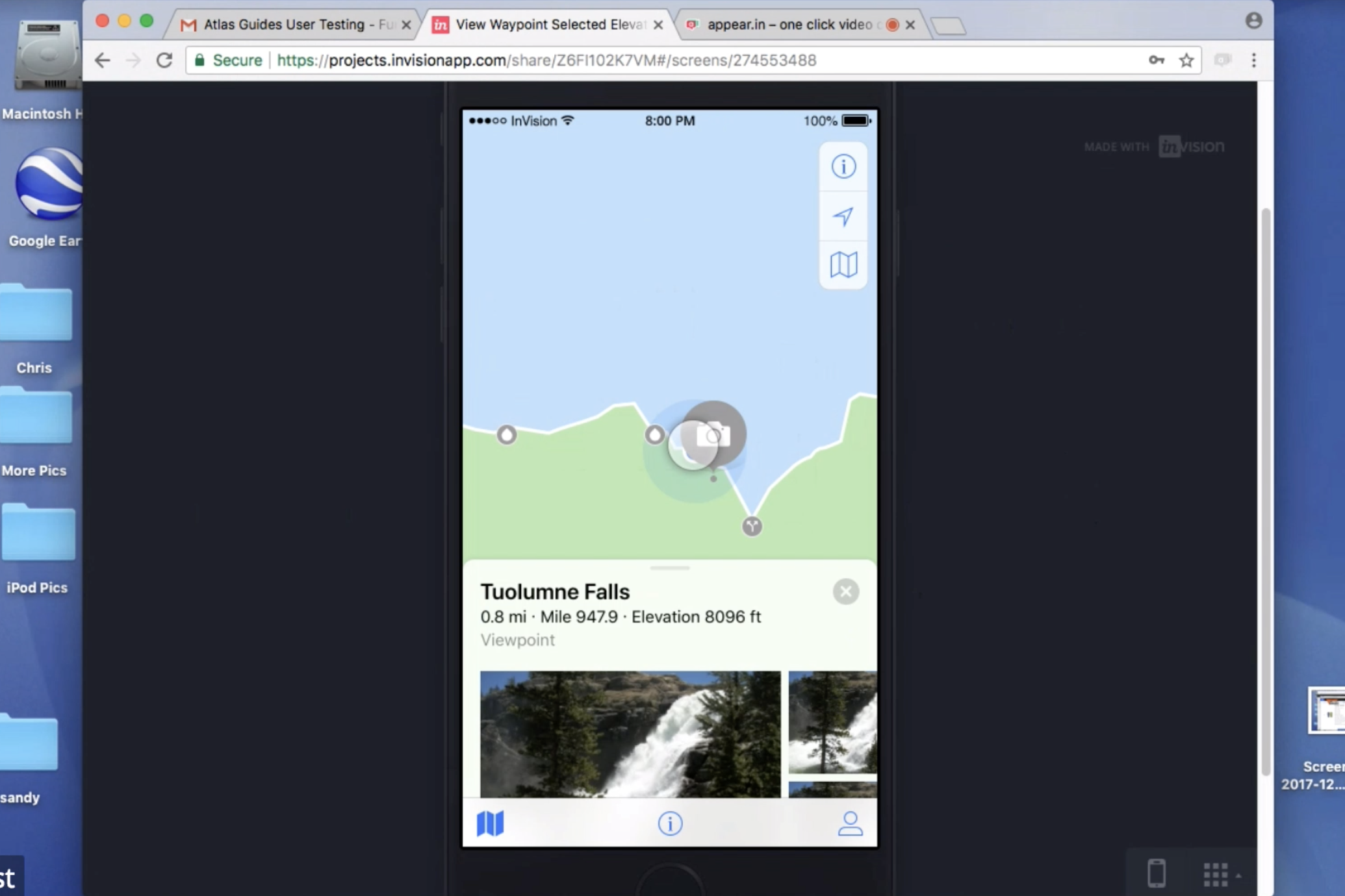
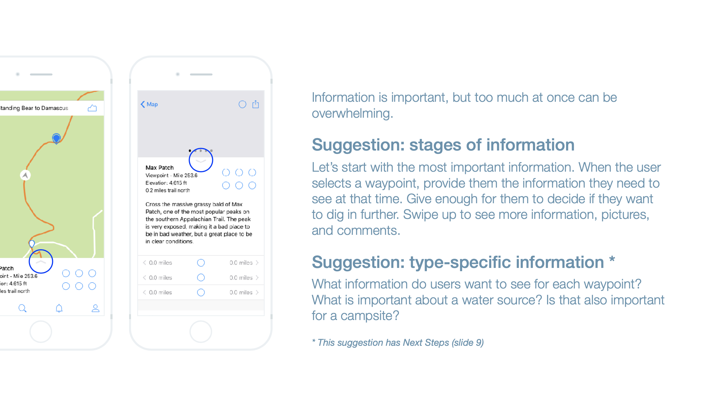
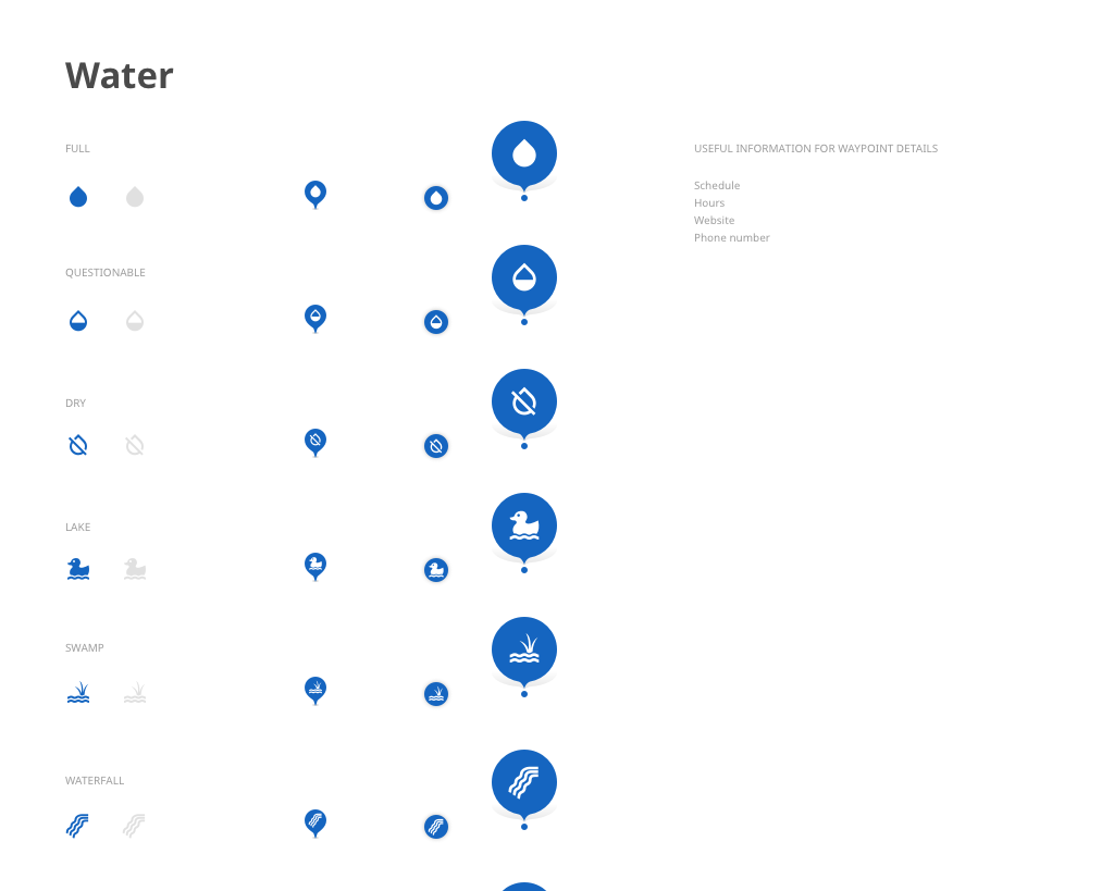
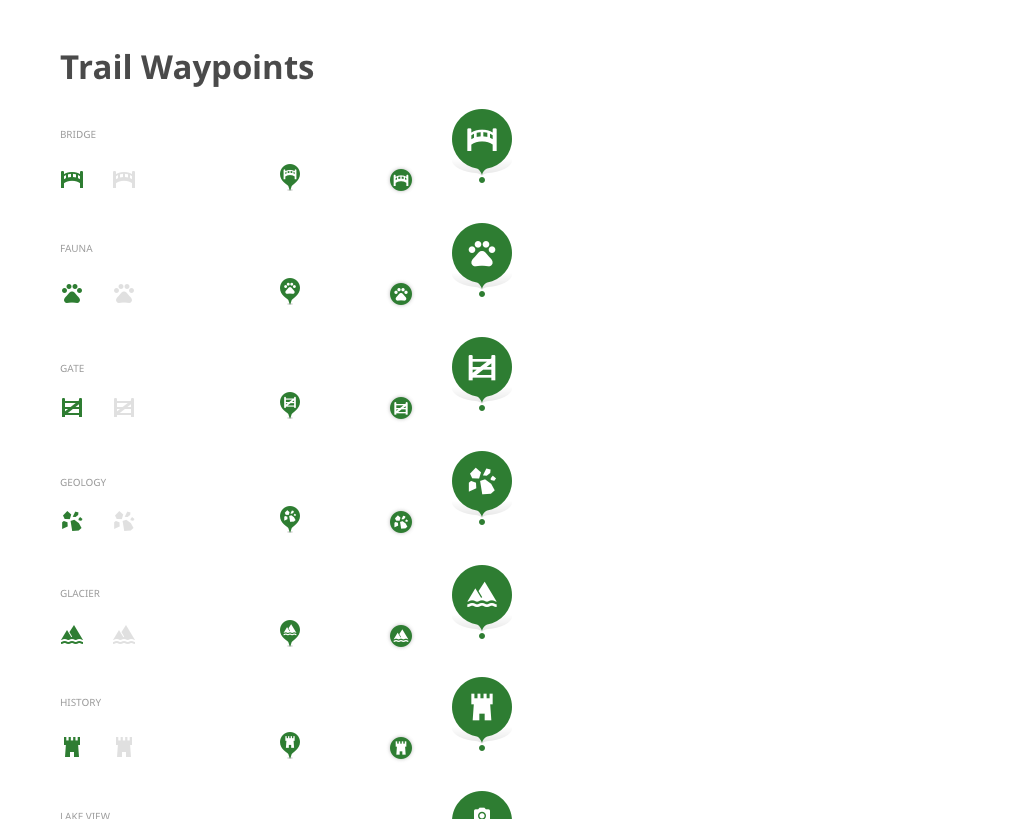
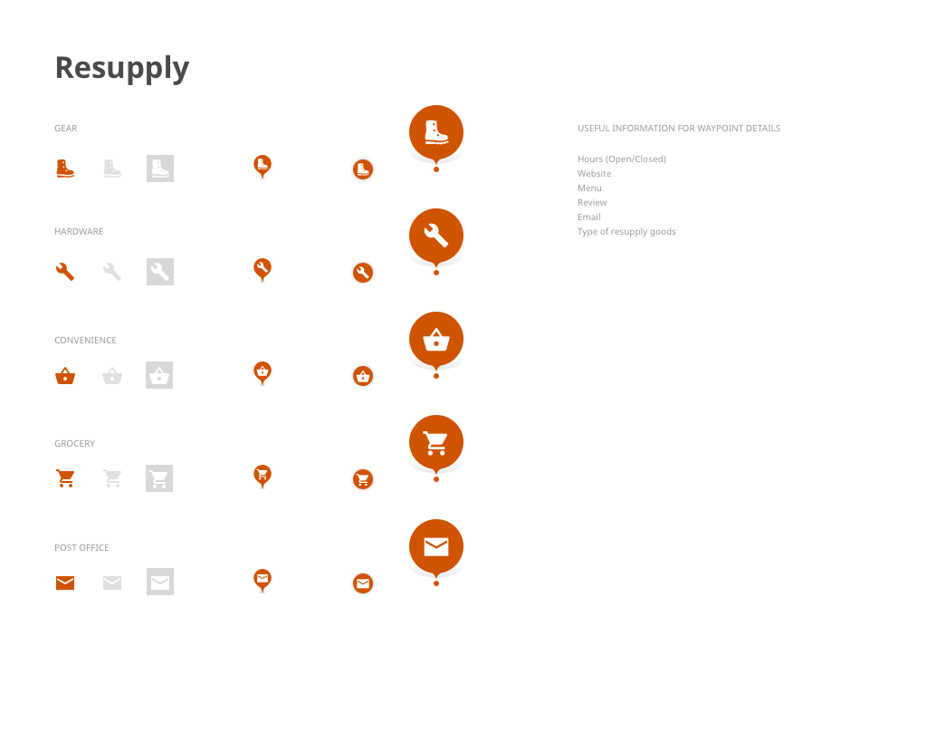
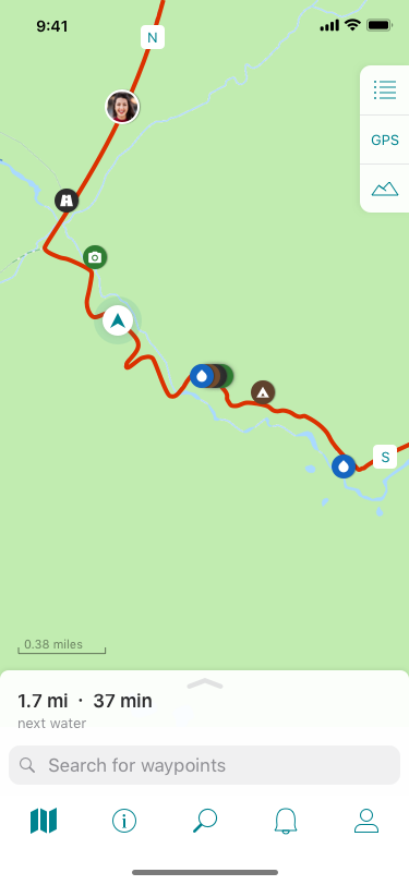
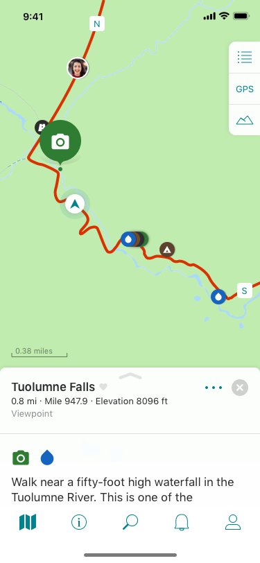
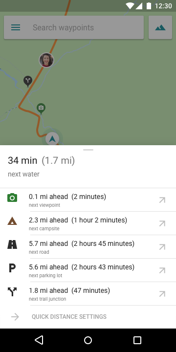
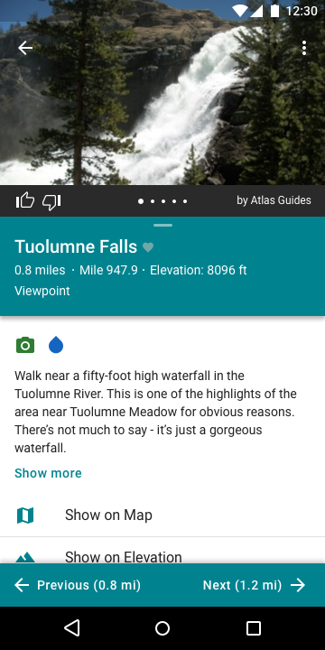
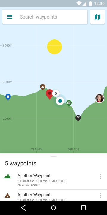
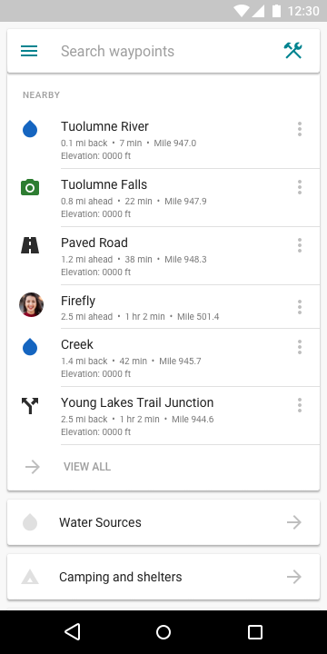
A major feature of the Guthook Guides app is the ability to see waypoints along the trail. These waypoints help hikers navigate confidently to their destination. These waypoints were also a major part of the redesign. Though they functioned reasonably well for most people, there were ways they could be improved. The original waypoints had small images that were often difficult to read, and beyond interpreting the icon/image, there was no easy way to understand what was located at that waypoint.
The redesign here had a couple parts:
First, all waypoints were organized into one of about 8 categories. These categories were then given a color. Thus, even if a hiker did not recognize the icon, they would know that a blue icon was a potential water source or that an orange icon was a place offering resupply options.
Second, the icons were redesigned to be one color against the contrasting category color. By making these compliant with WCAG AA guidelines, we ensure that more of our users are able to easily understand the waypoint icons.
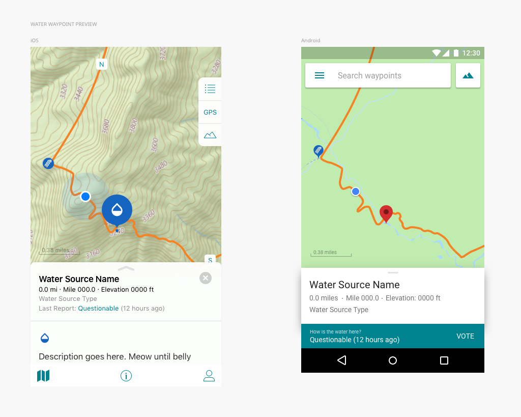
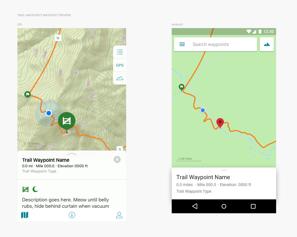
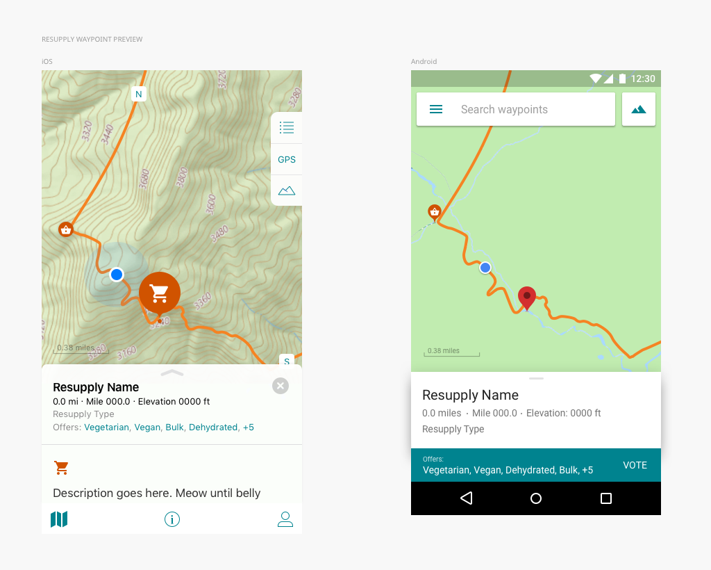
High-Fidelity Wireframes
Using the wireframes that I had already created as well as the new company brand and new UI components, I drafted a series of high-fidelity wireframes for use by the rest of the team.
This process included extensive feedback from the rest of the team, including technical feasibility discussions and discussions around data model updates.
As a note, the images displayed here are more recent as the features and capabilities of the app have continued to evolve since the inception of this redesign project.


Prototype
After creating high-fidelity mockups, I imported them into InVision, using the tool to create a clickable prototype. The purpose of this was multi-faceted. Not only could we use InVision’s tools to experience the prototype as if it were a live app and thereby pinpoint awkward moments in the designed experience, I was also able to quickly and easily share assets and specs with both our Android developer and our iOS developer.
Retrospective: A small team of passionate individuals working on a much-beloved app.
The transition from enterprise-scale B2B software design to a small consumer-focused startup was a drastic one. Going from a global company of over 500,000 employees to a team of 5 was a radical shift, and one I never expected to make at quite this scale. However, it allowed me to focus on a project that dovetailed with one of my hobbies and passions: hiking. It also gave me the opportunity to have a significant seat at the table in terms of direction of the product, something that I had not yet experienced in my career, and something that I am grateful for. Working on the Guthook Guides app also gave me the opportunity to connect with the larger outdoor recreation community, which allowed me to form connections and friendships with a variety of nonprofits, companies, and individuals.
Check out another project from my time at Atlas Guides!

GUTHOOK GUIDES Social
Mobile App | New Feature Project
A tool to help hikers stay connected, the social features of the Guthook Guides app allow hikers to send updates to those following along with their adventure.